— PROJECT NAME
Wellness Pet Company
— ROLE
Brand Identity
Art Direction
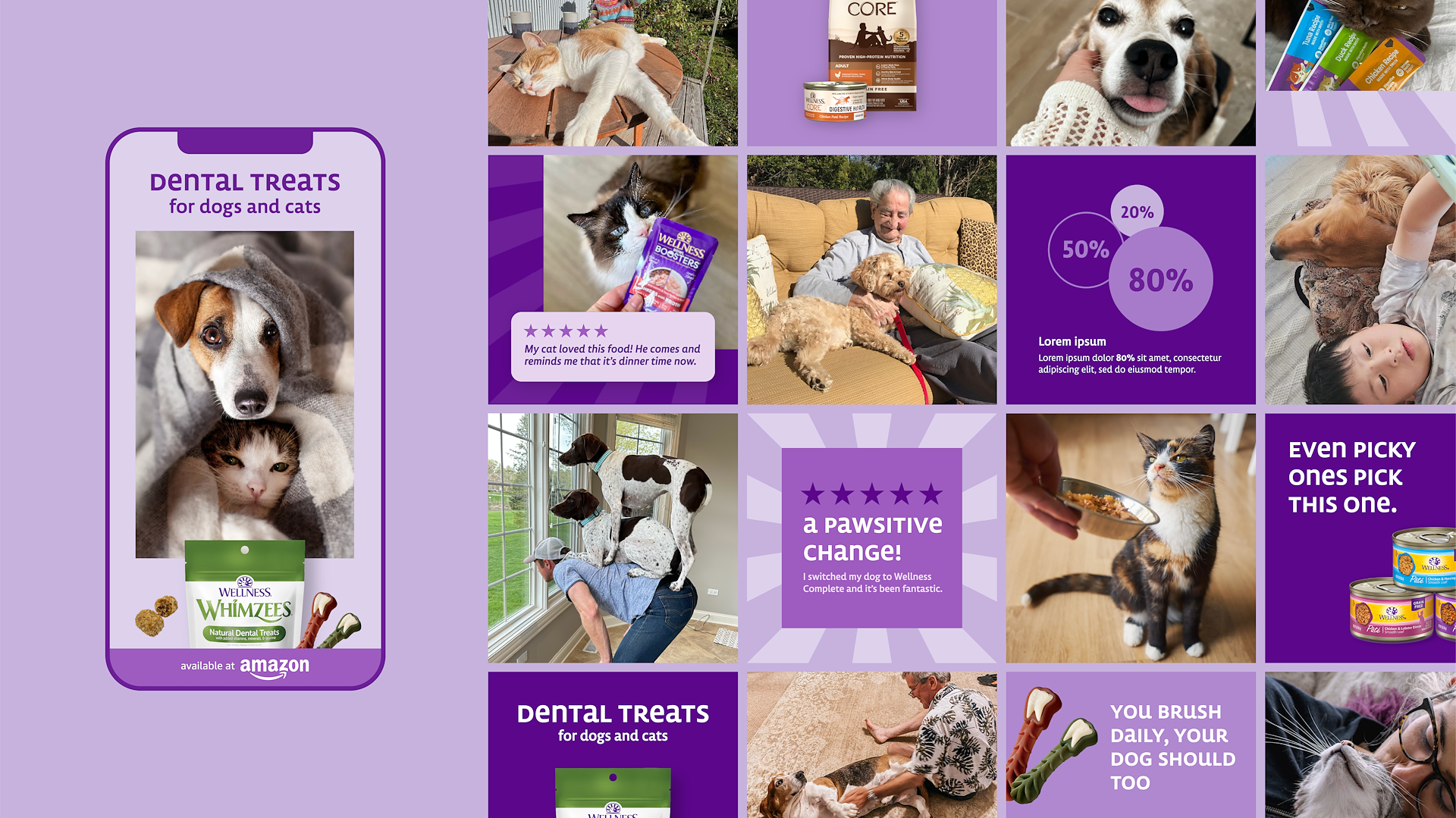
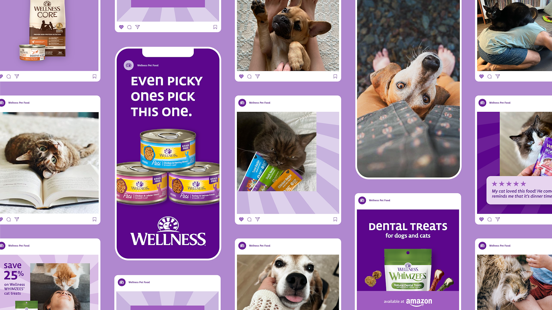
In a saturated pet food category overflowing with shouty claims, cluttered packaging and clinical jargon, it was hard for any brand to truly connect—let alone stand out. The space felt noisy and impersonal, leaving pet parents overwhelmed instead of inspired. Wellness needed a bold, design-led approach to cut through the chaos and speak directly to a younger, more design-conscious generation.

So we went all in on purple—an unexpected, ownable color in the category—and built a brand that felt fresh, expressive and unmistakably modern. The identity mixed light, airy photography with personality-infused unicase typography that felt like your dog got ahold of a pen and left you a message. Patterns inspired by the sun/moon face icon in the logo added warmth and symbolism, weaving in a sense of care that spans day and night. The result: a system that felt just as comfortable on a shelf as it did in someone’s Instagram feed.


From social and swag to Zoom backgrounds, email templates, digital banners and print, the system flexed effortlessly across every touchpoint. Its modular nature allowed for easy customization while staying visually consistent and emotionally resonant. More than just beautiful design, the brand became a toolkit—easy to use, hard to ignore and impossible to confuse with anything else in the category.
Ultimately, it gave Wellness the edge it needed to stand out, build recognition and create deeper connections with a new generation of pet owners.


Zoom Ui Vectors by Vecteezy: https://www.vecteezy.com/free-vector/zoom-ui


Agency
Leadership
Design/AD
- Carli Bruckmueller