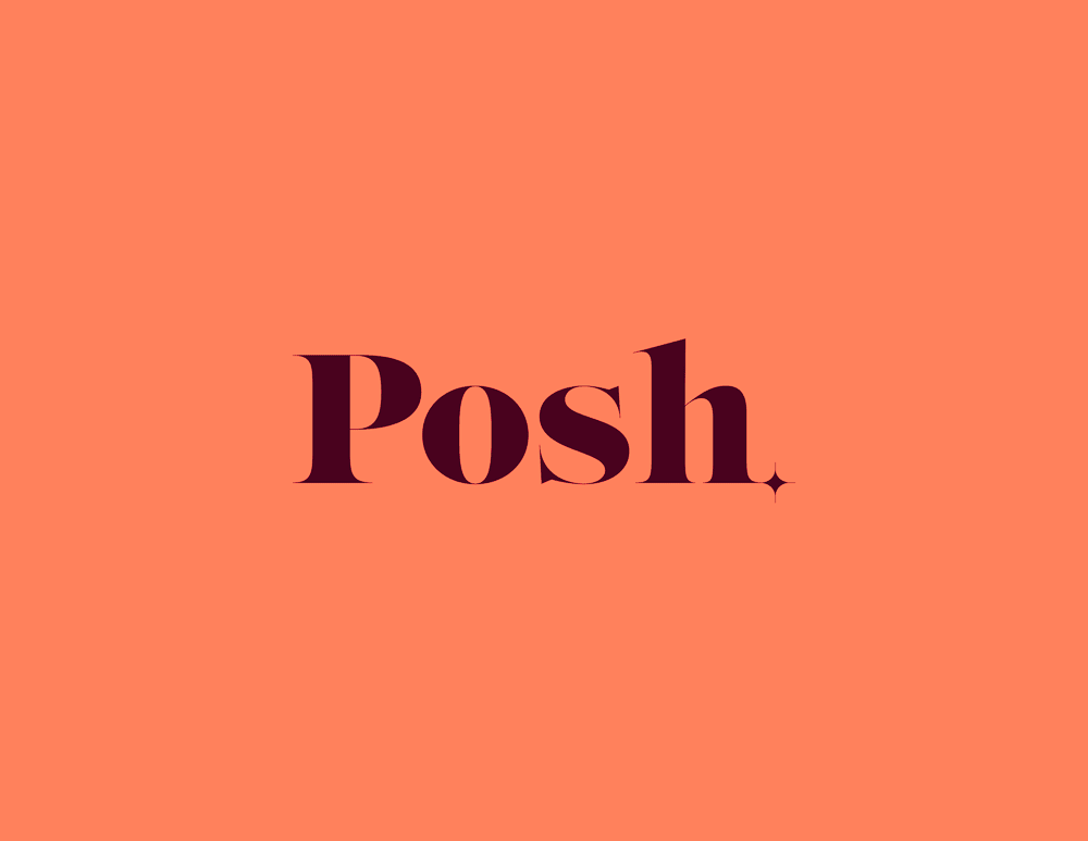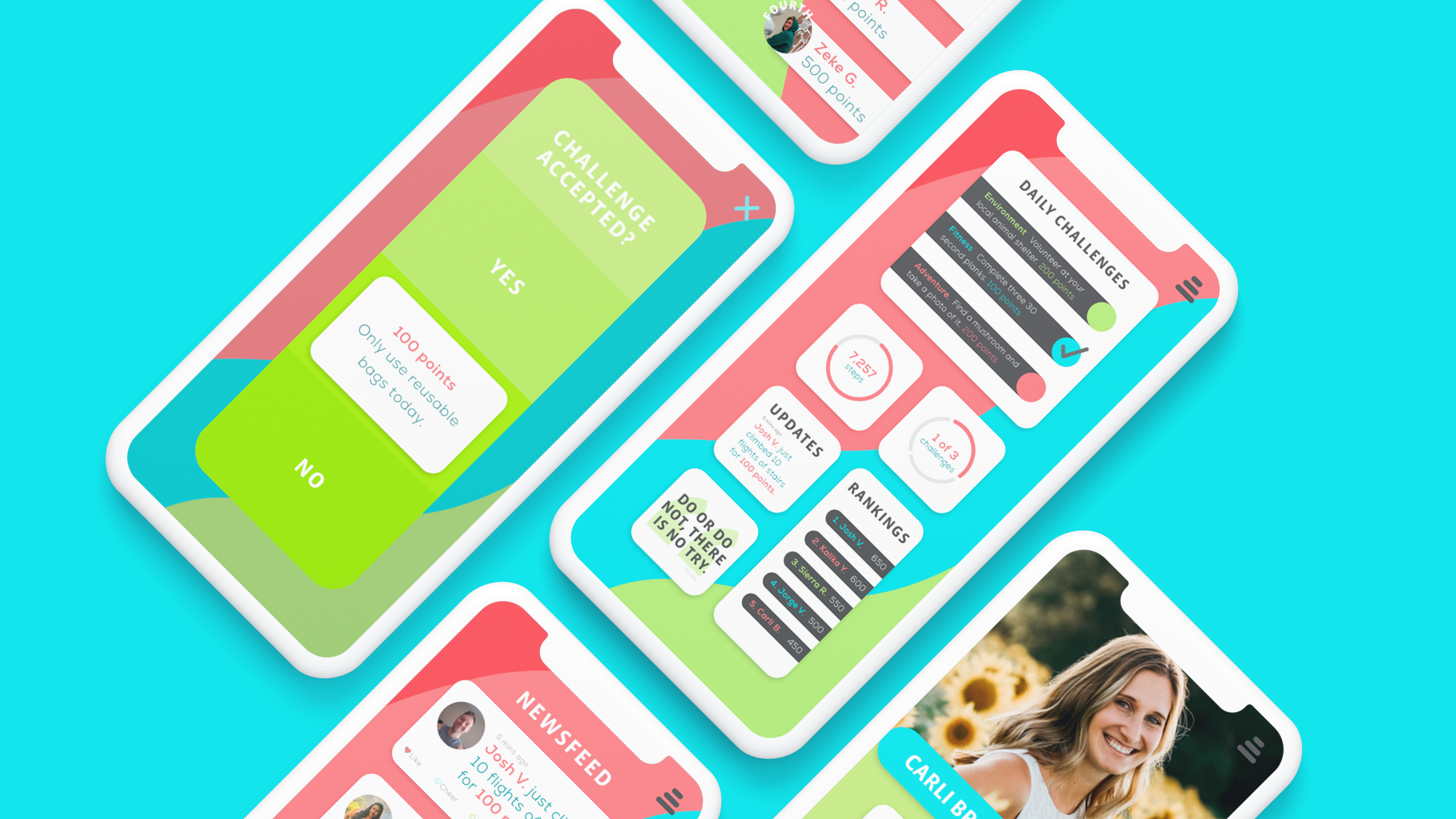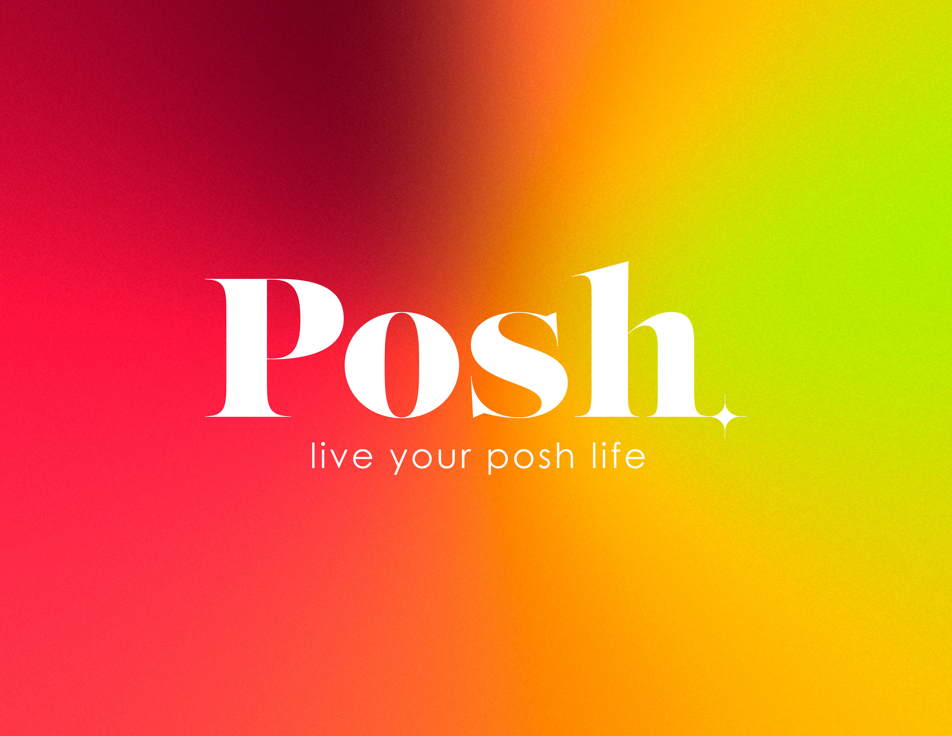

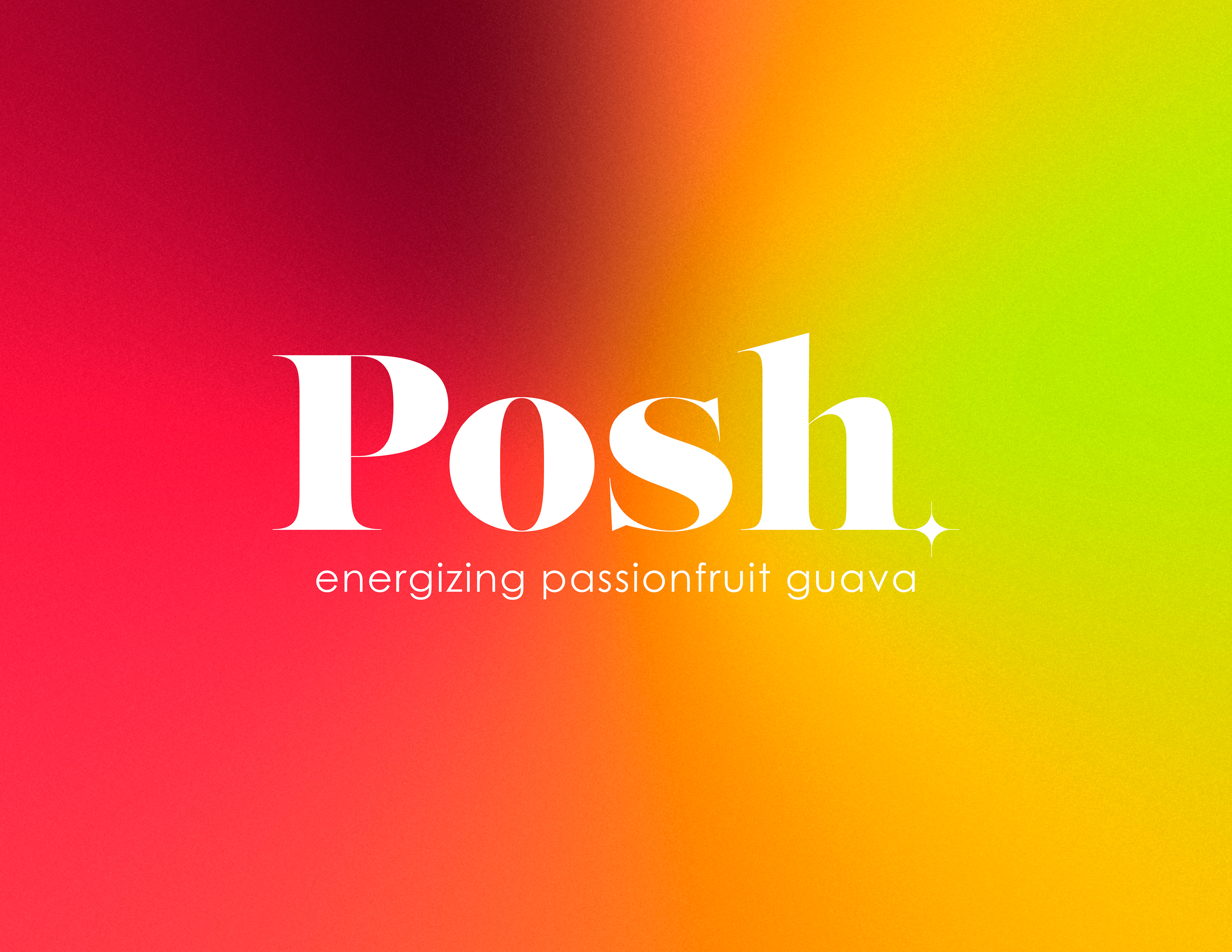
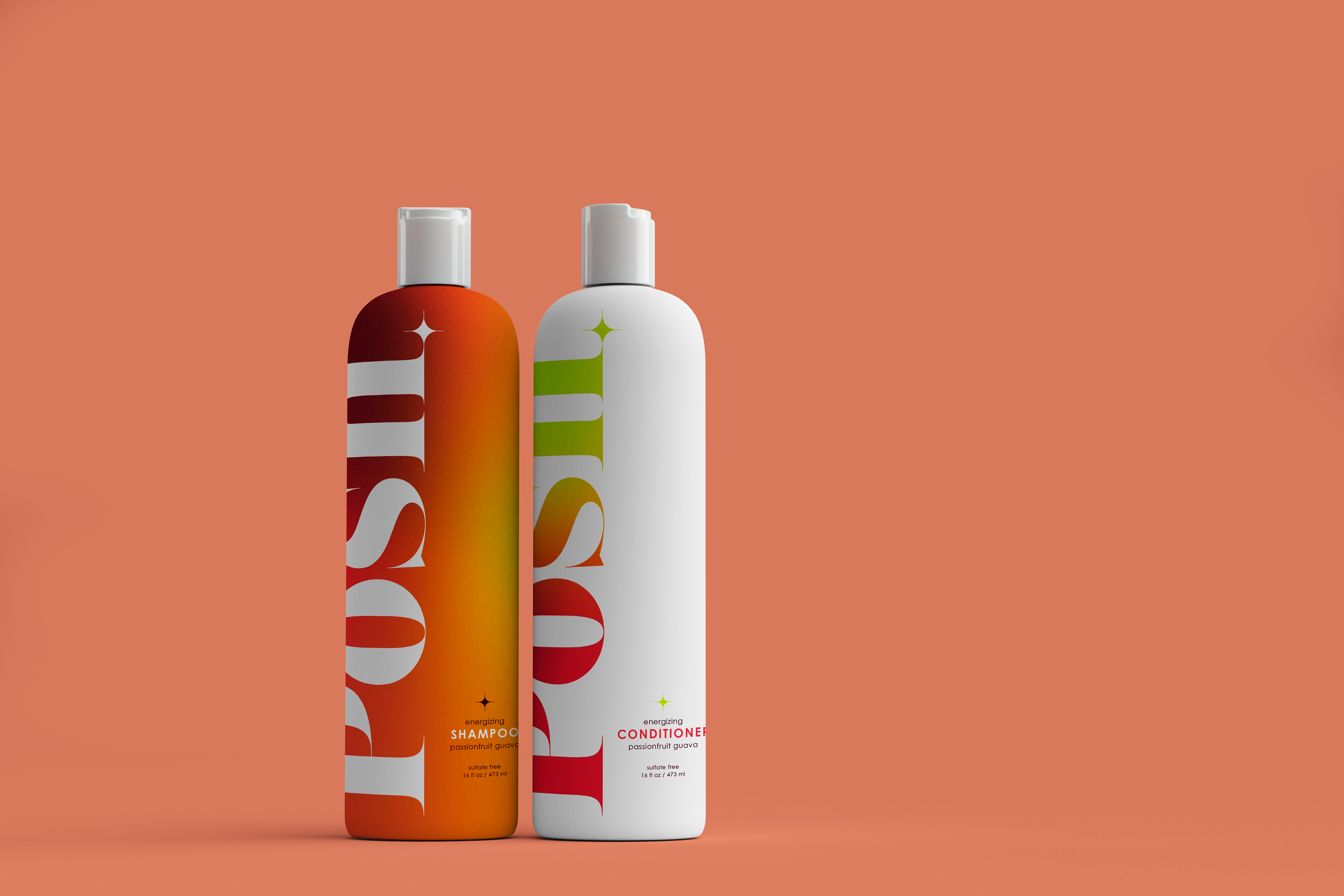
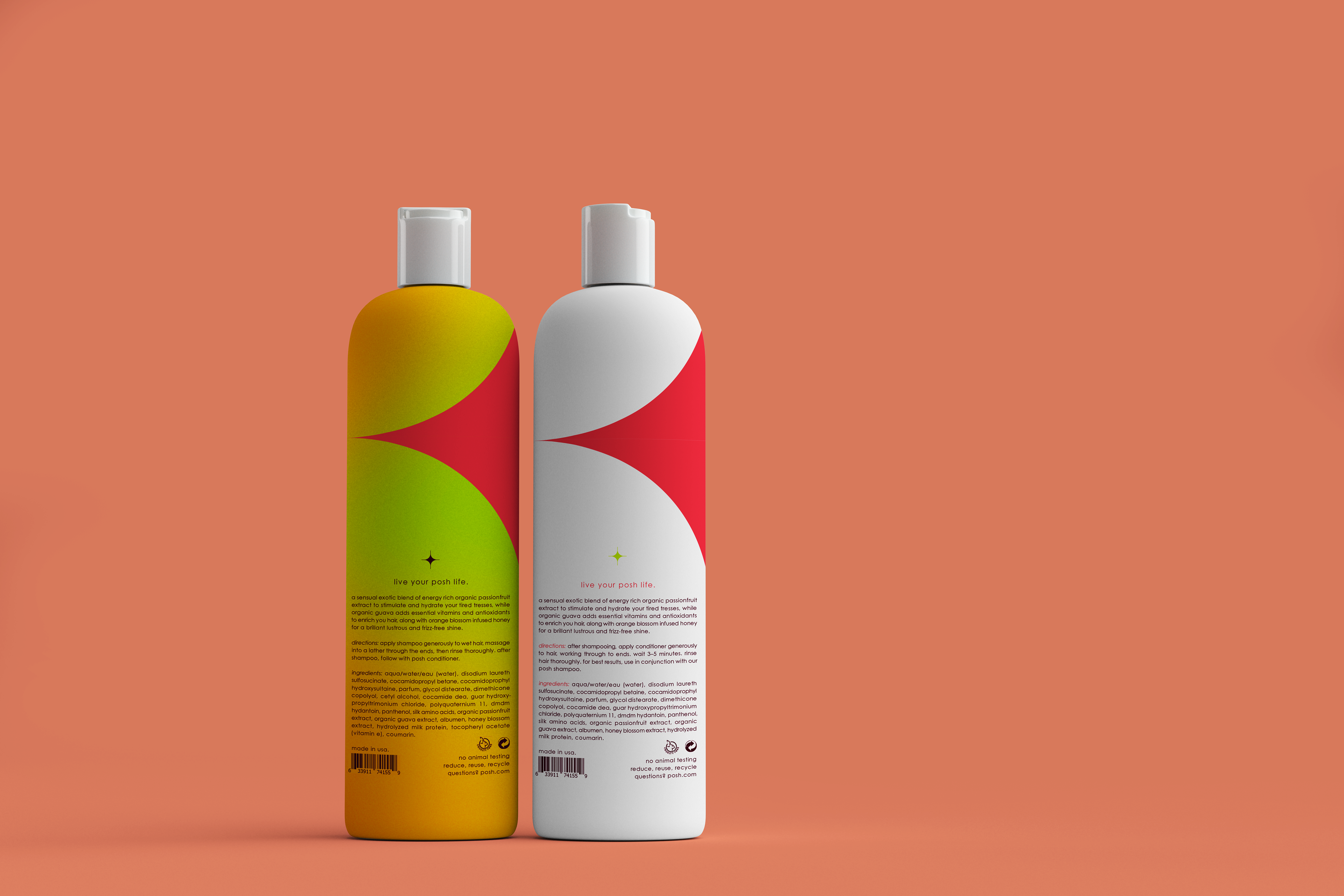
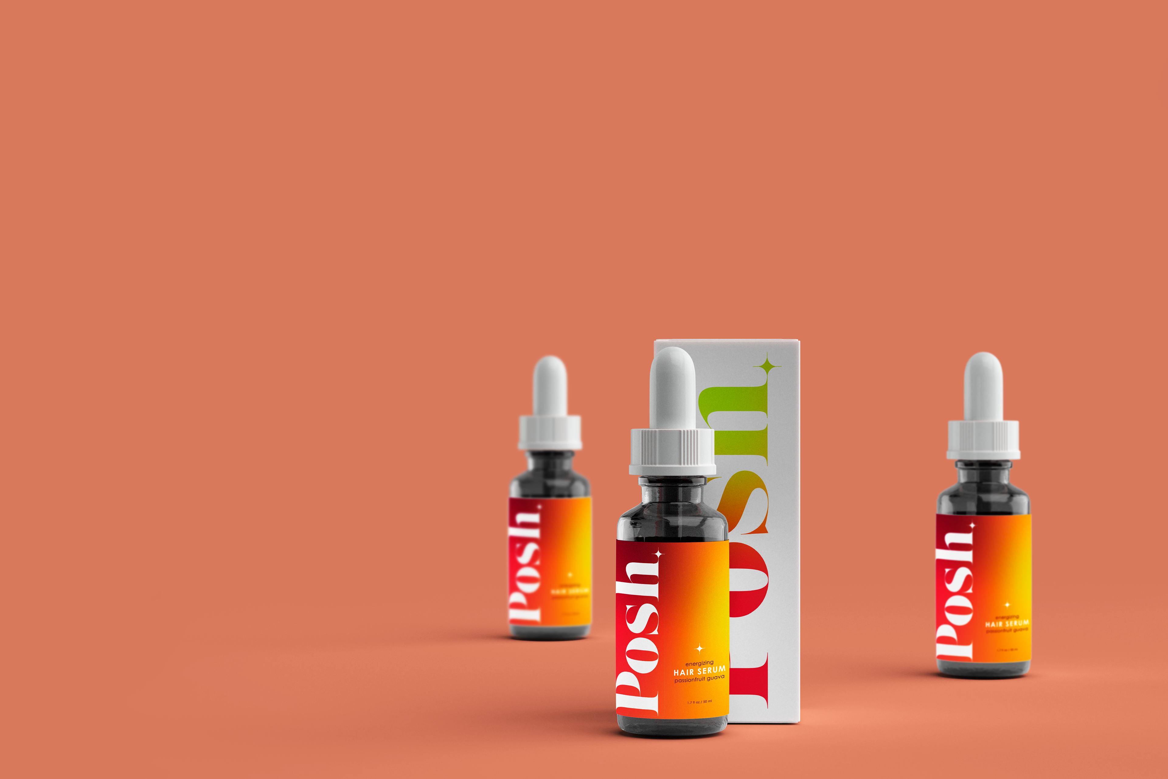
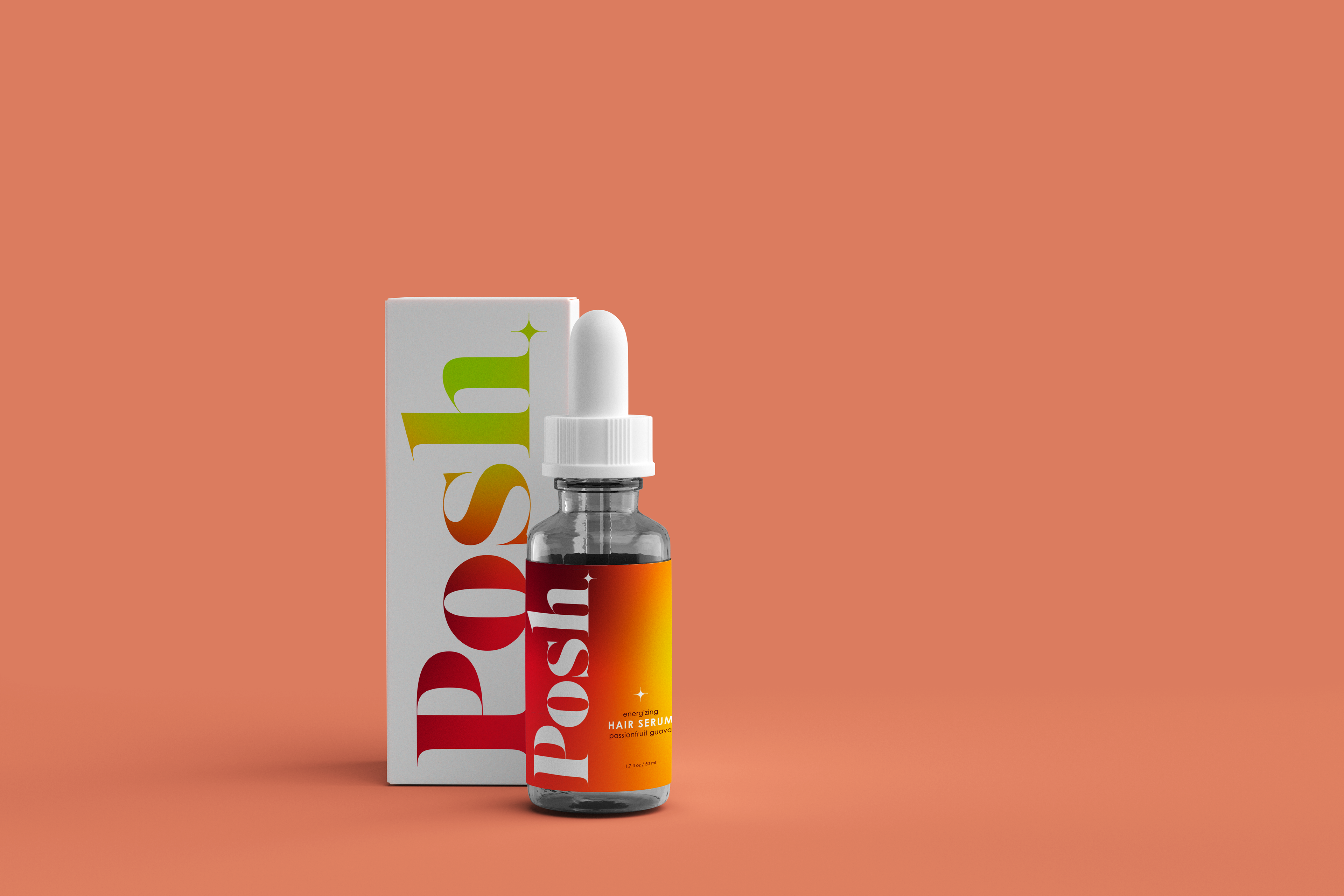
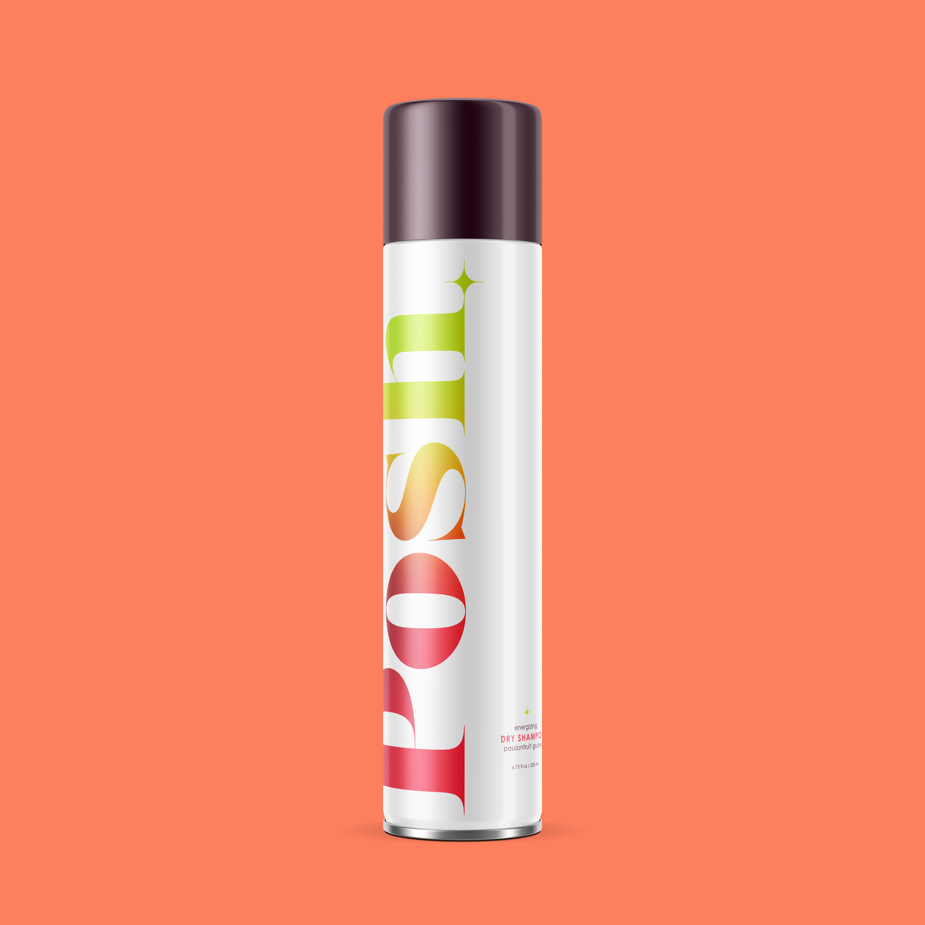
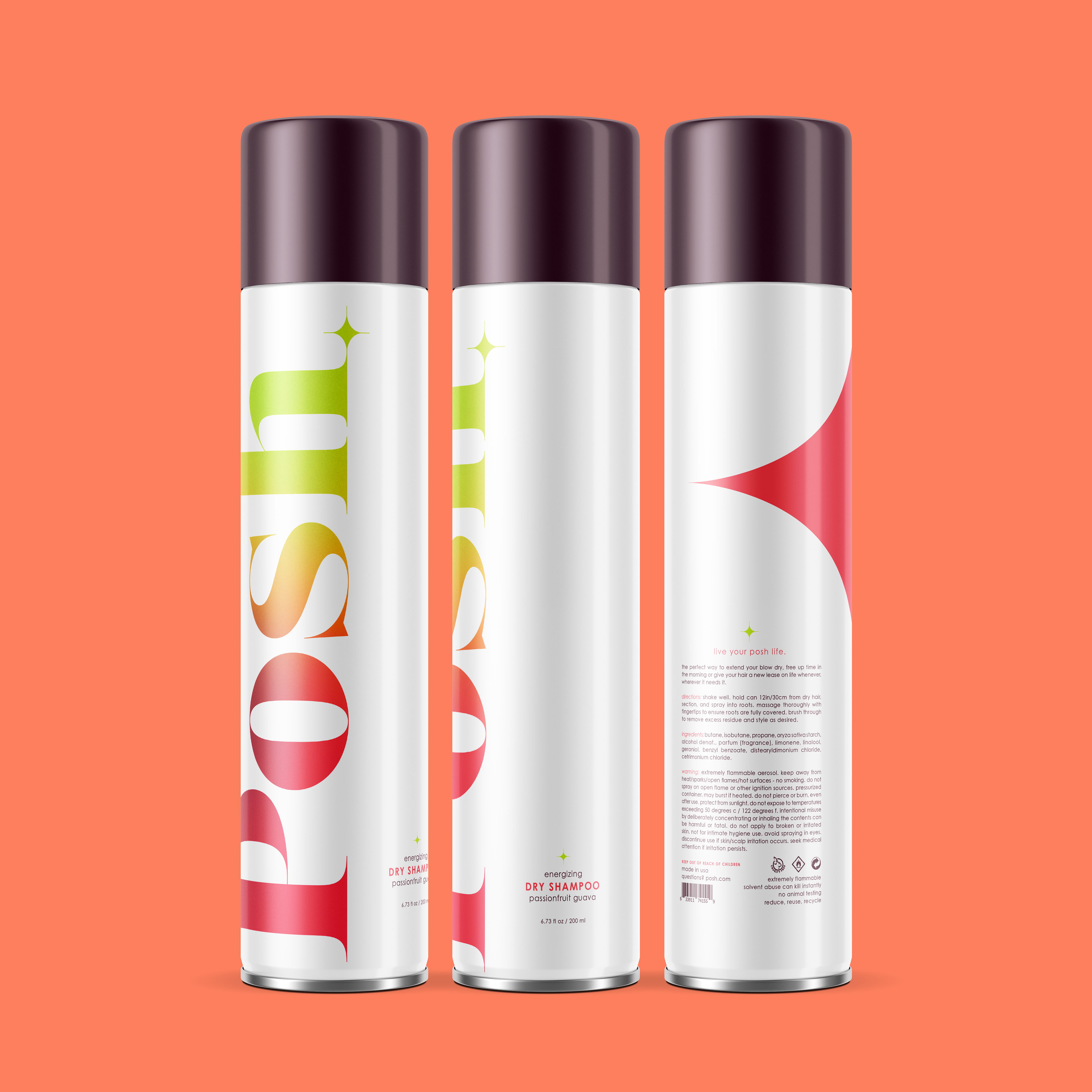
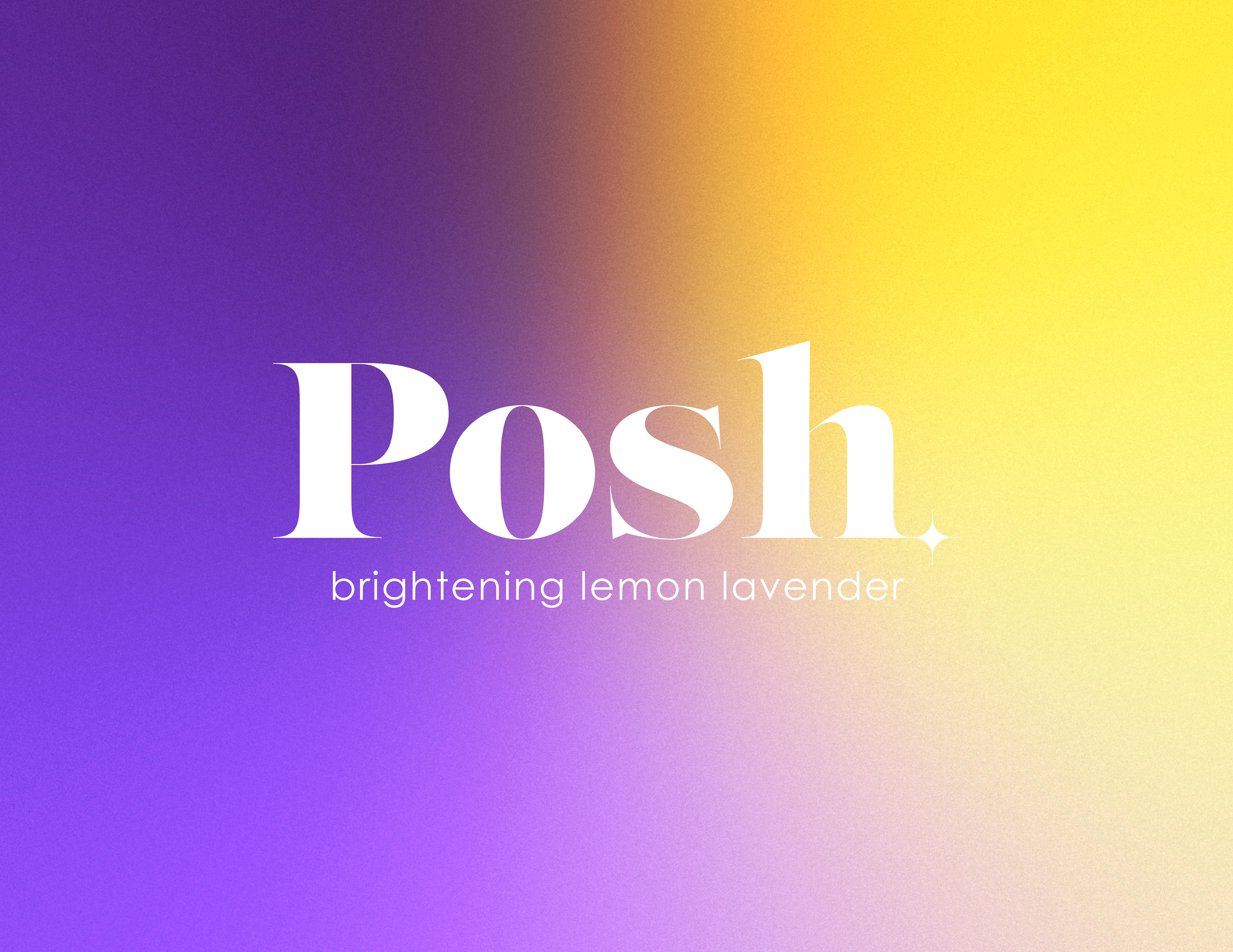
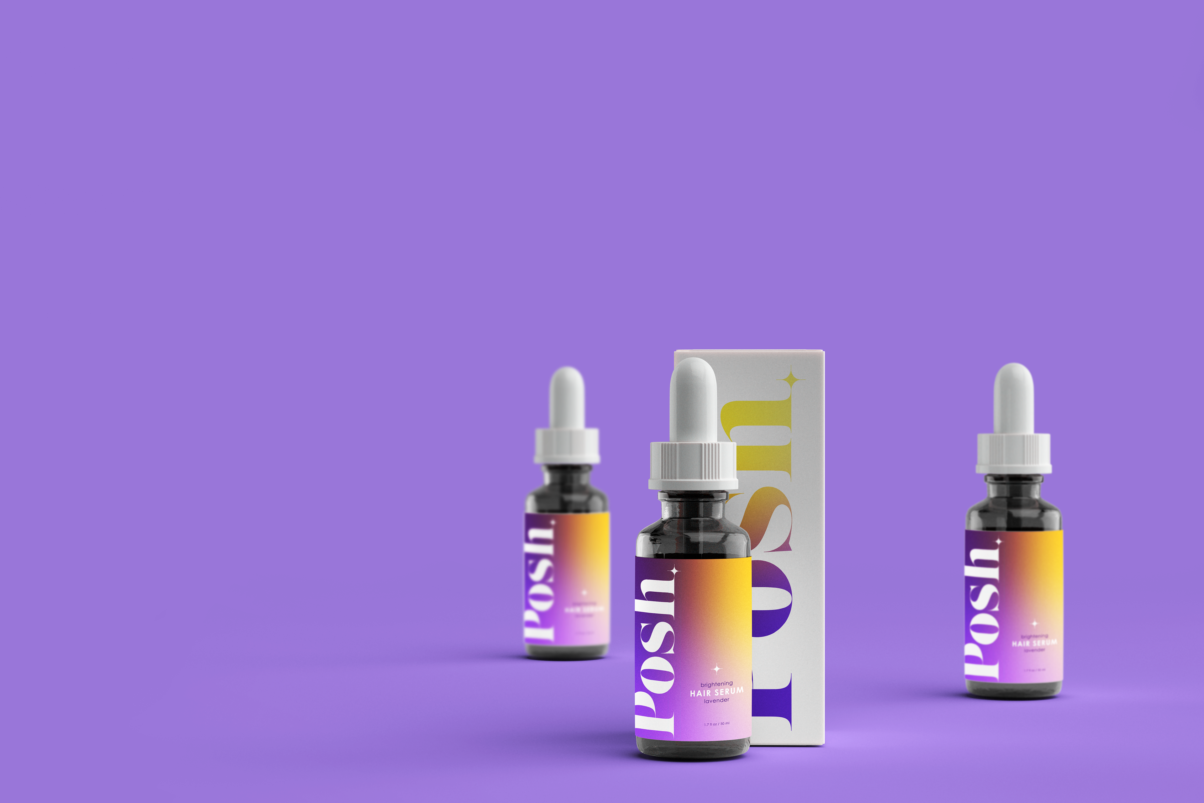
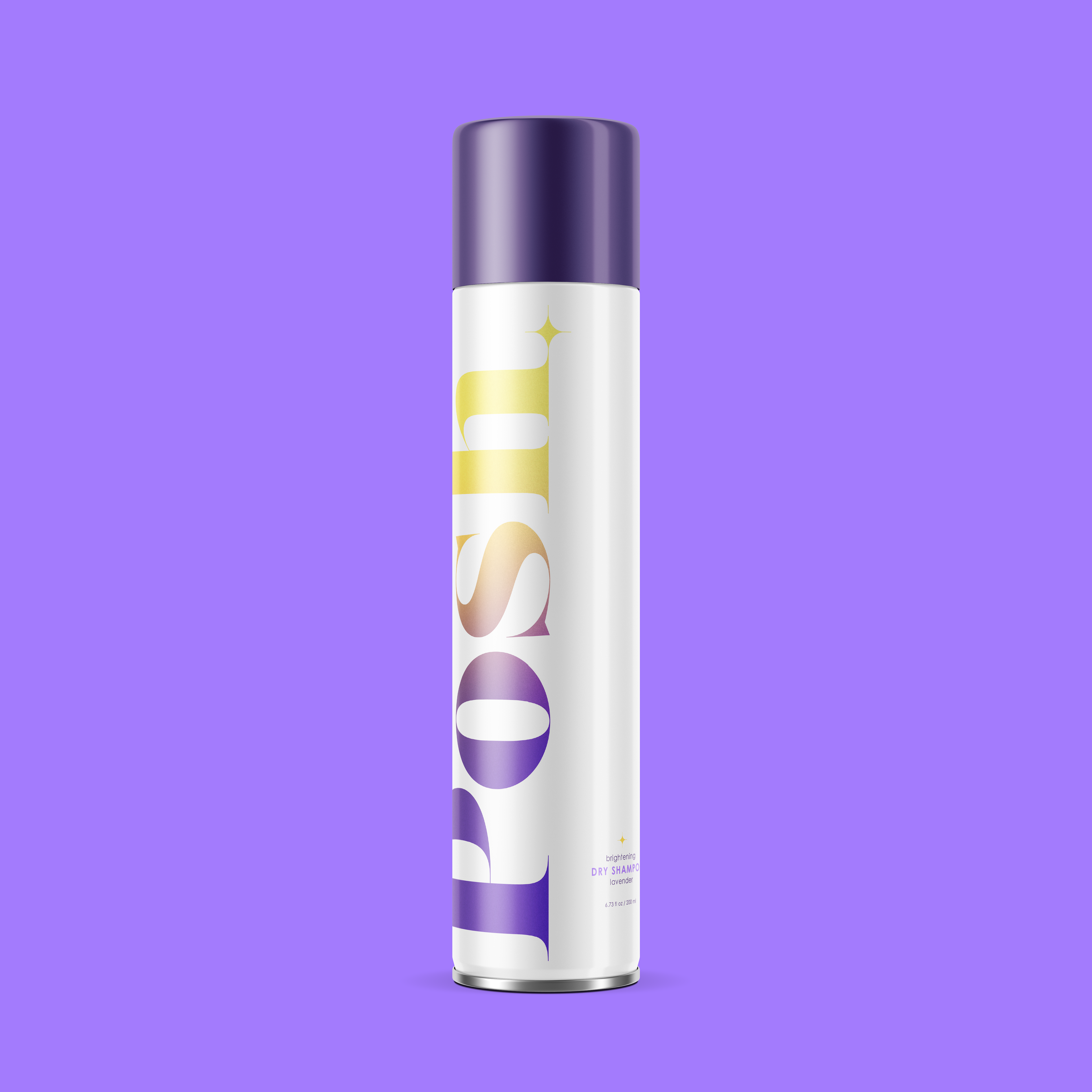
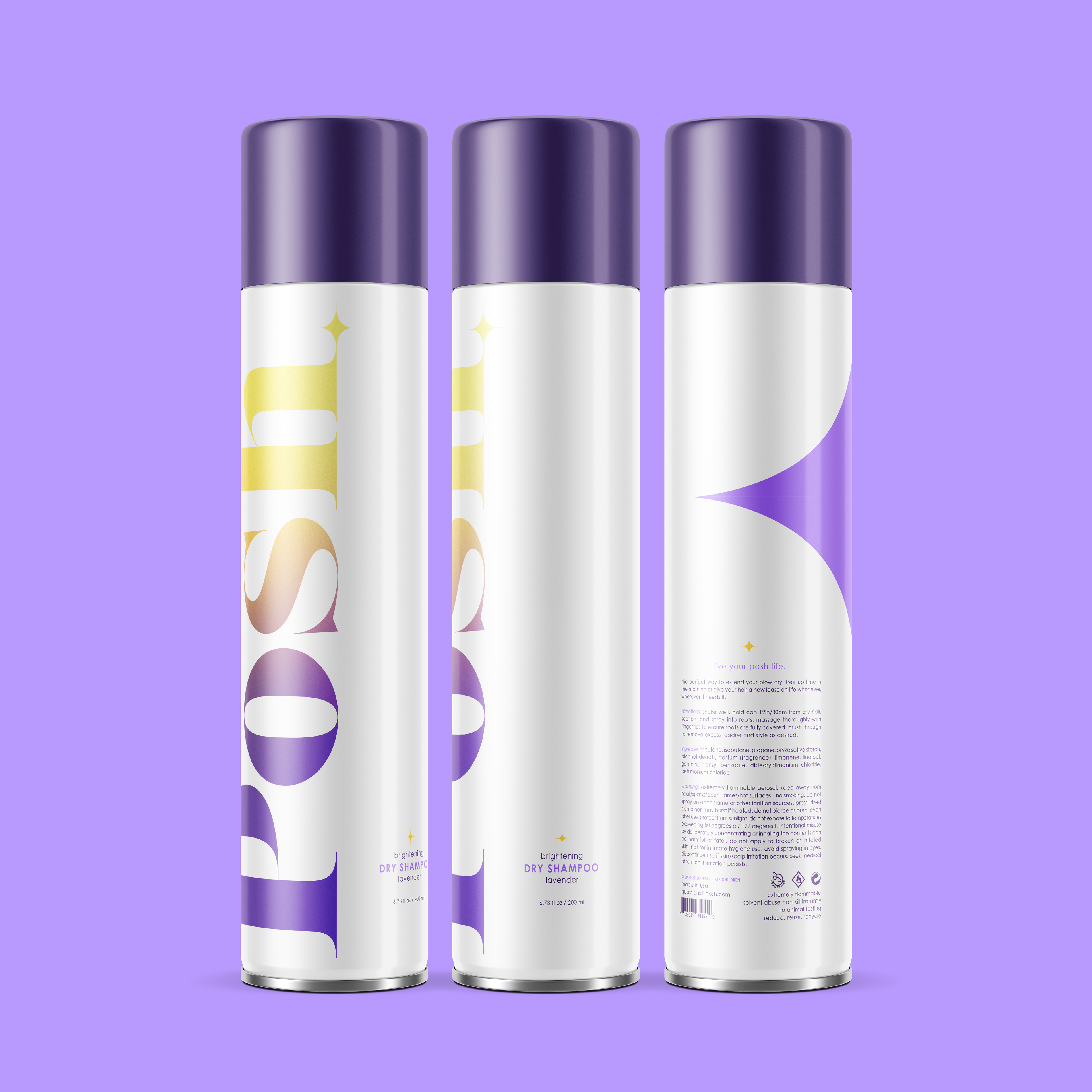
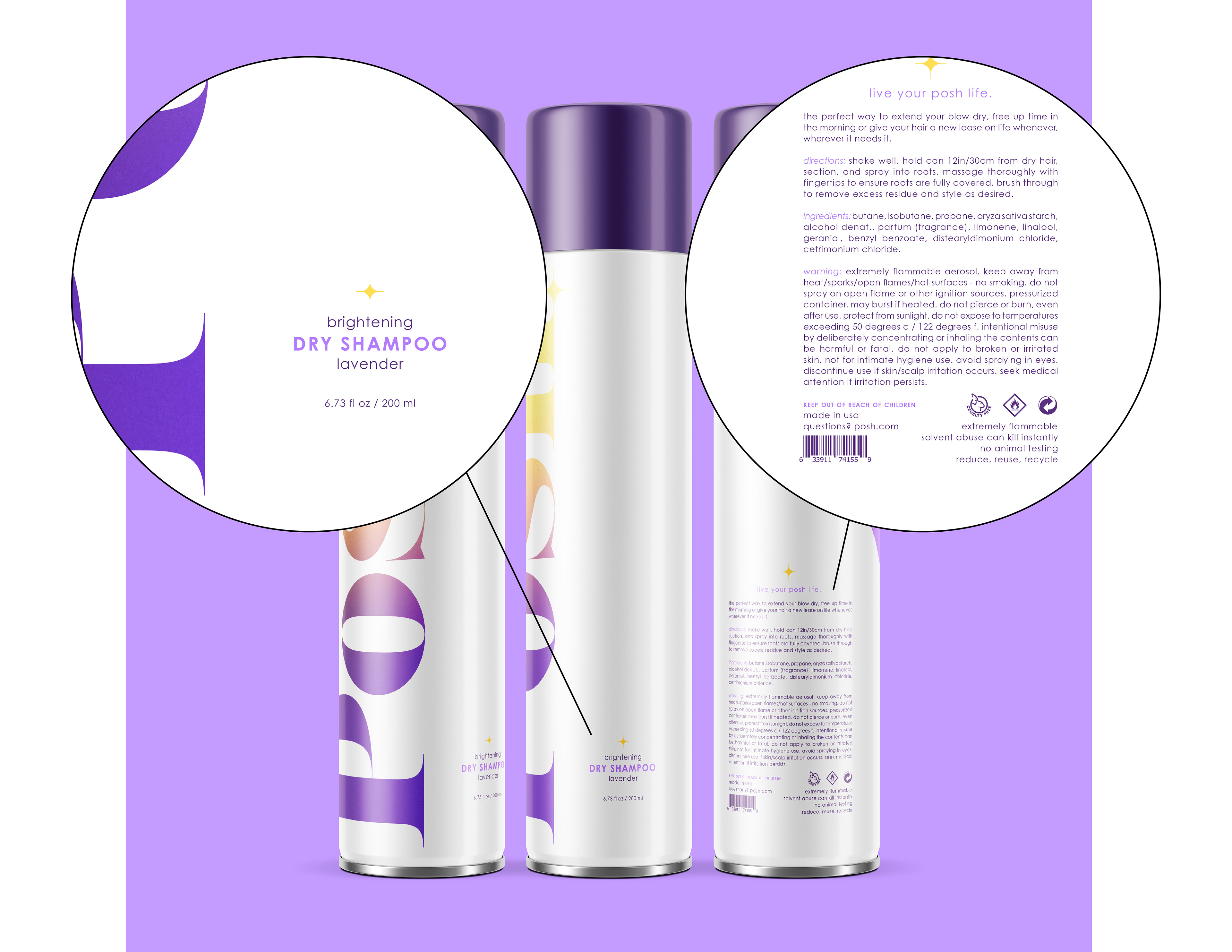
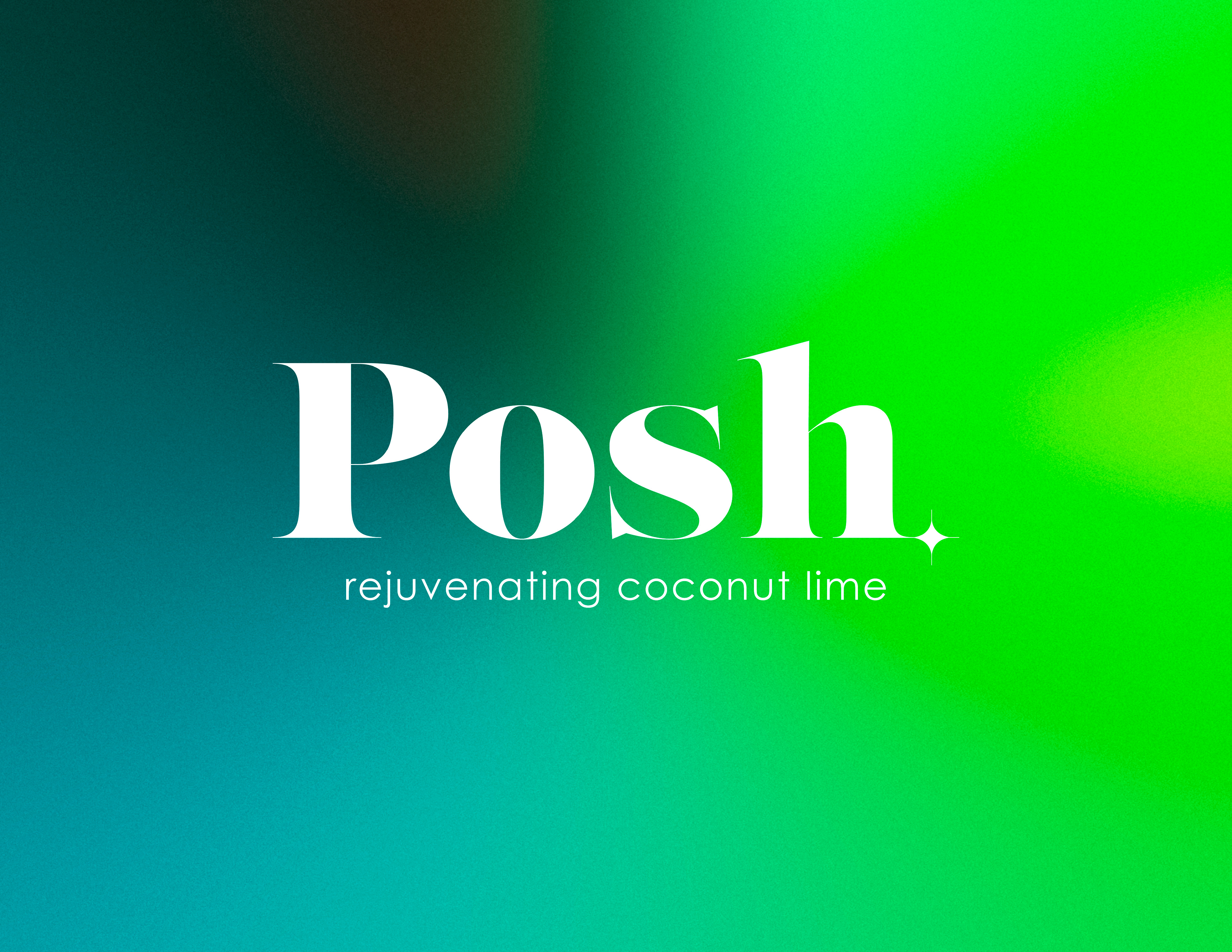
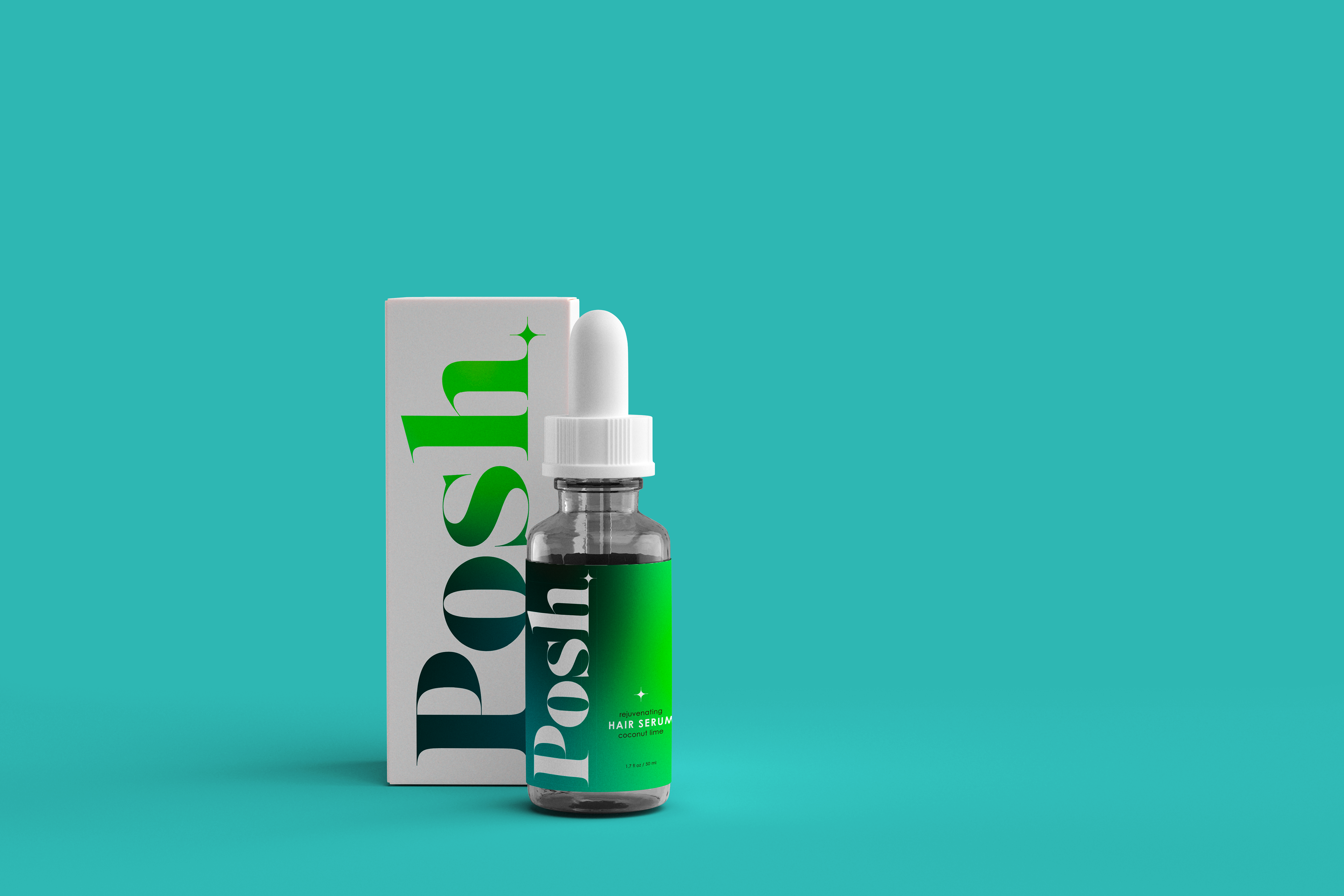
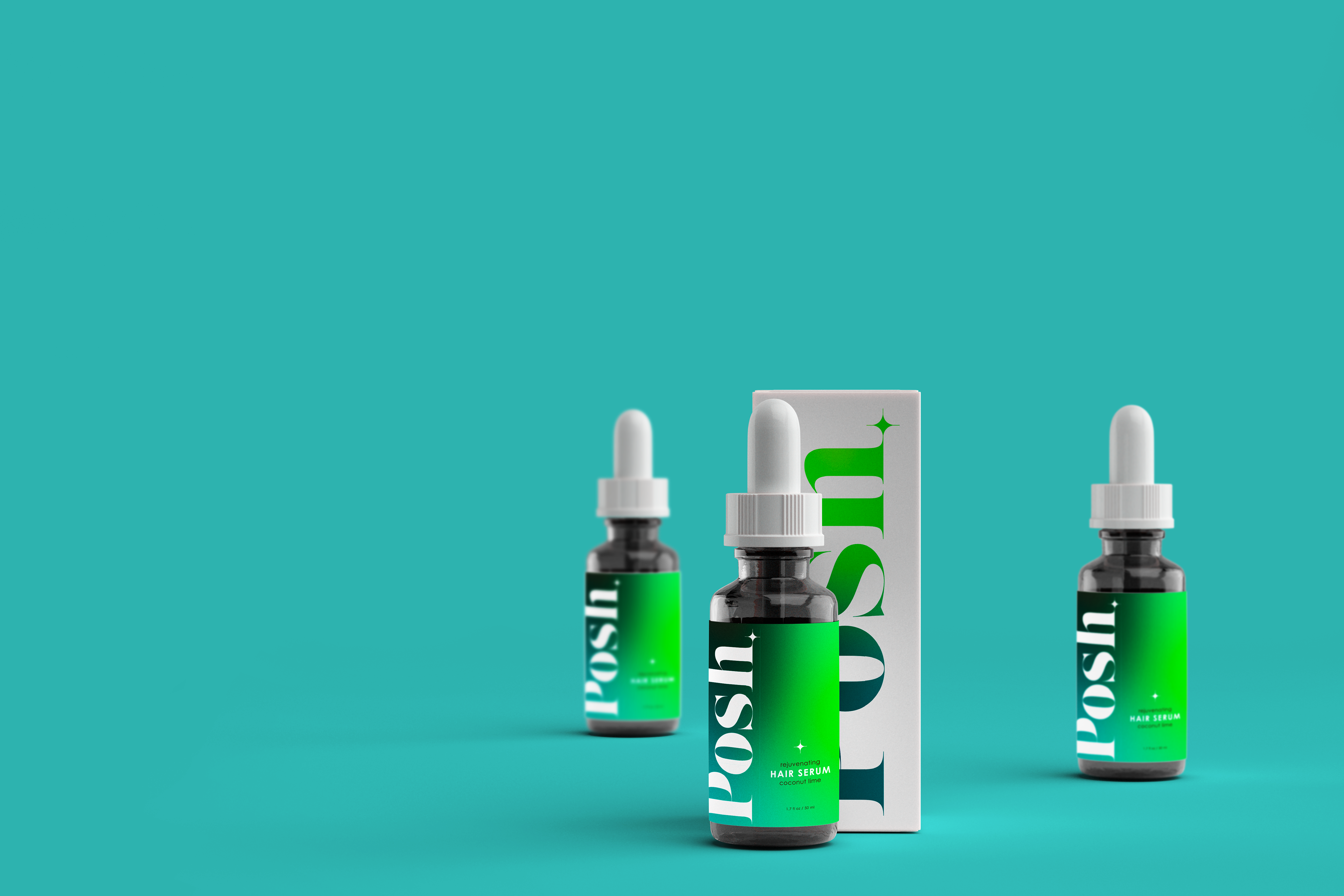
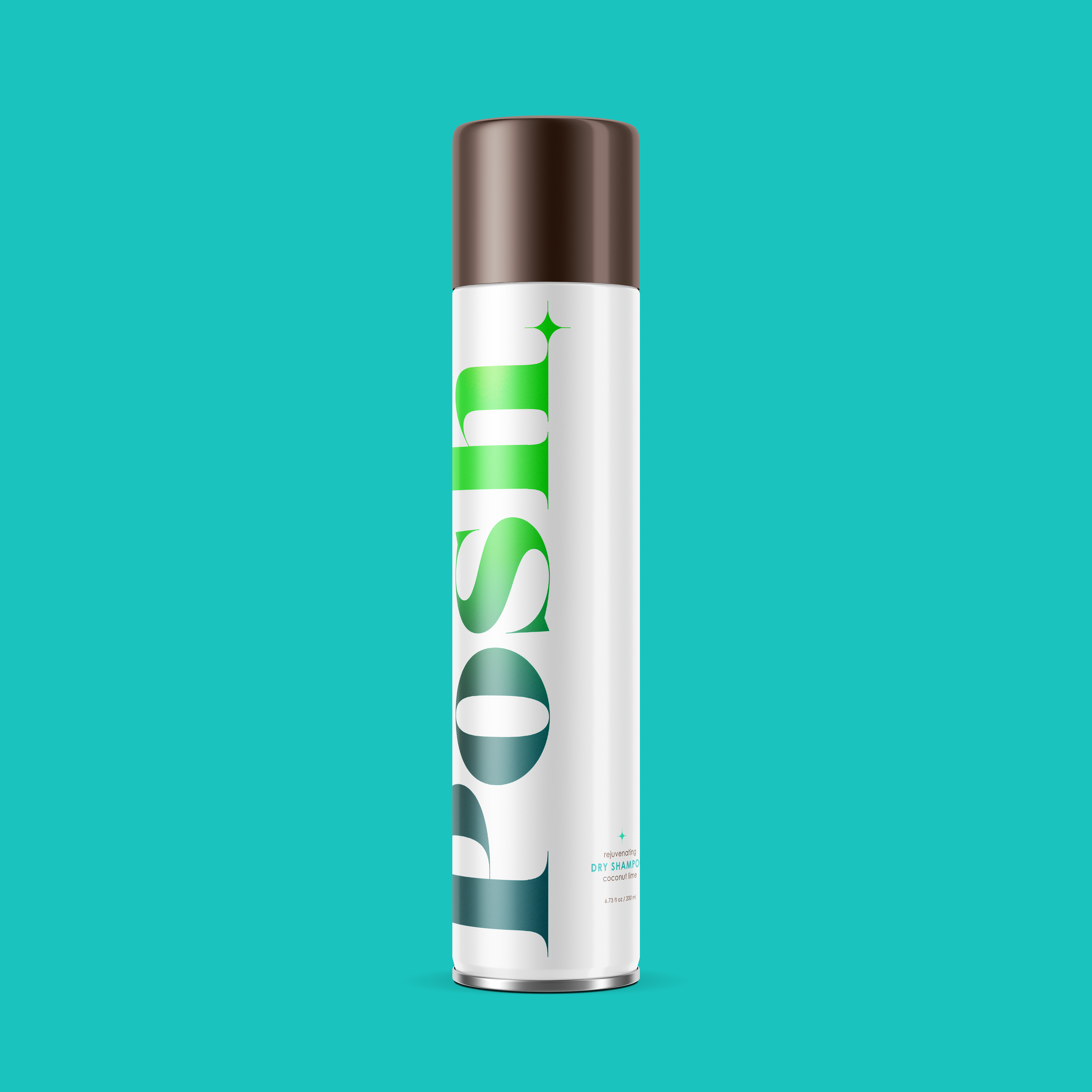
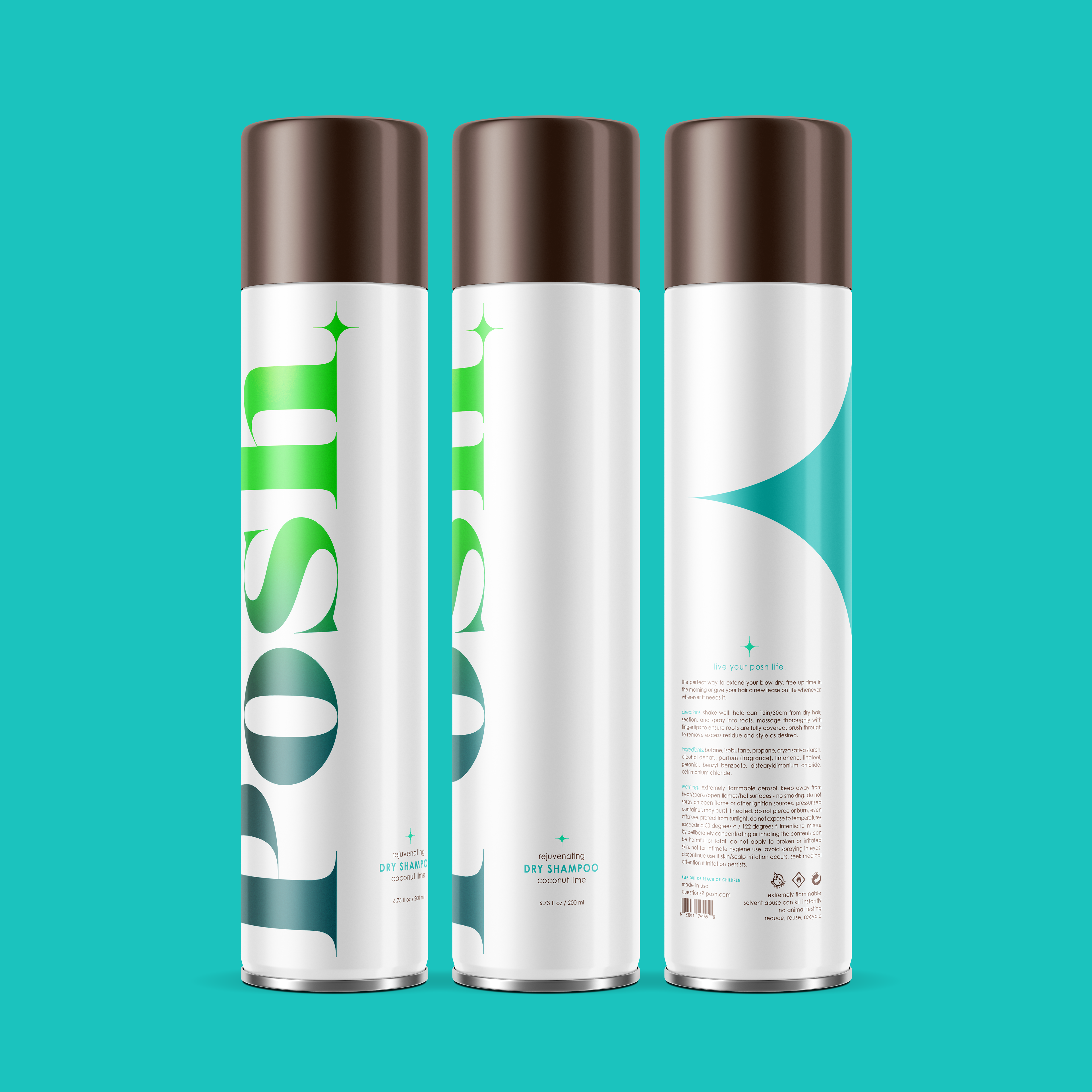
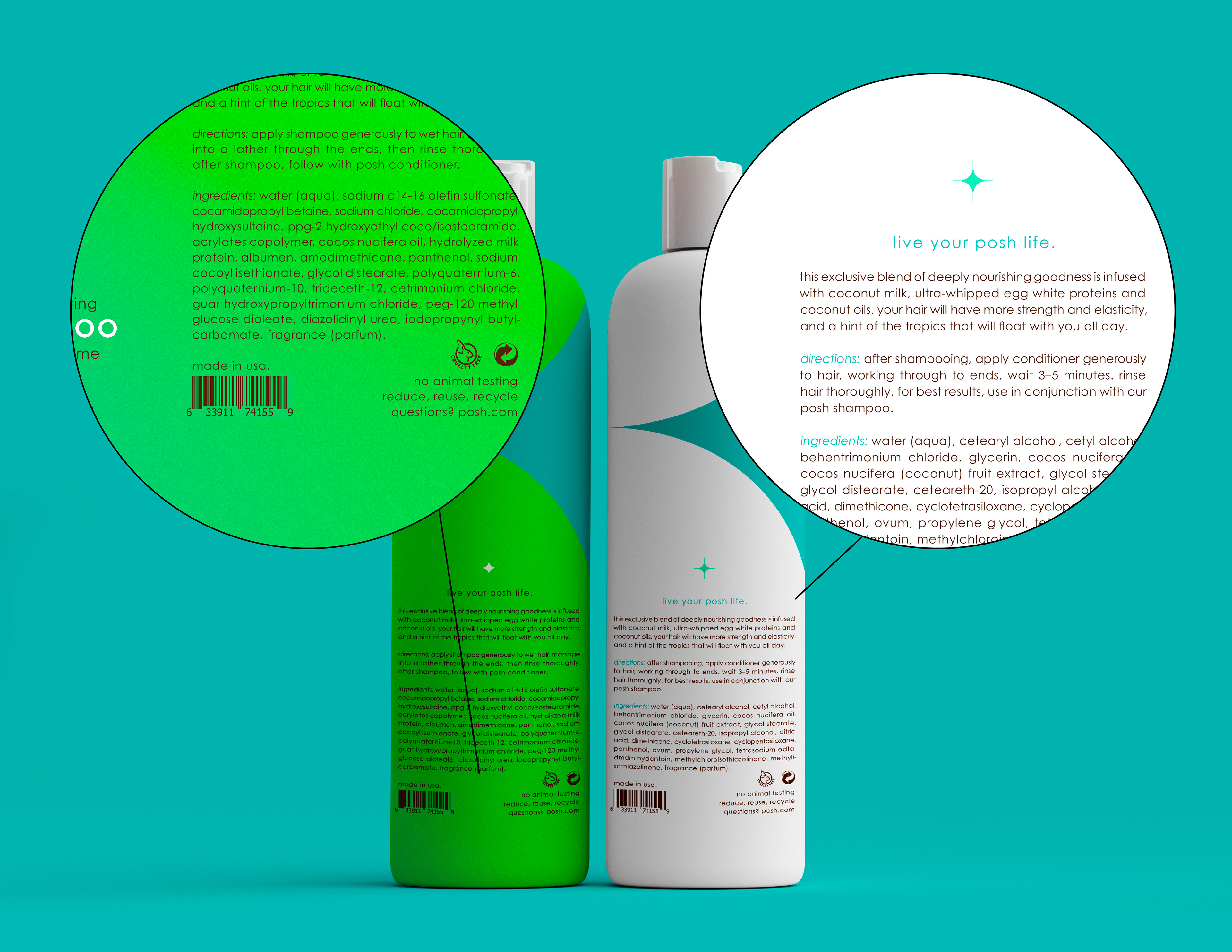
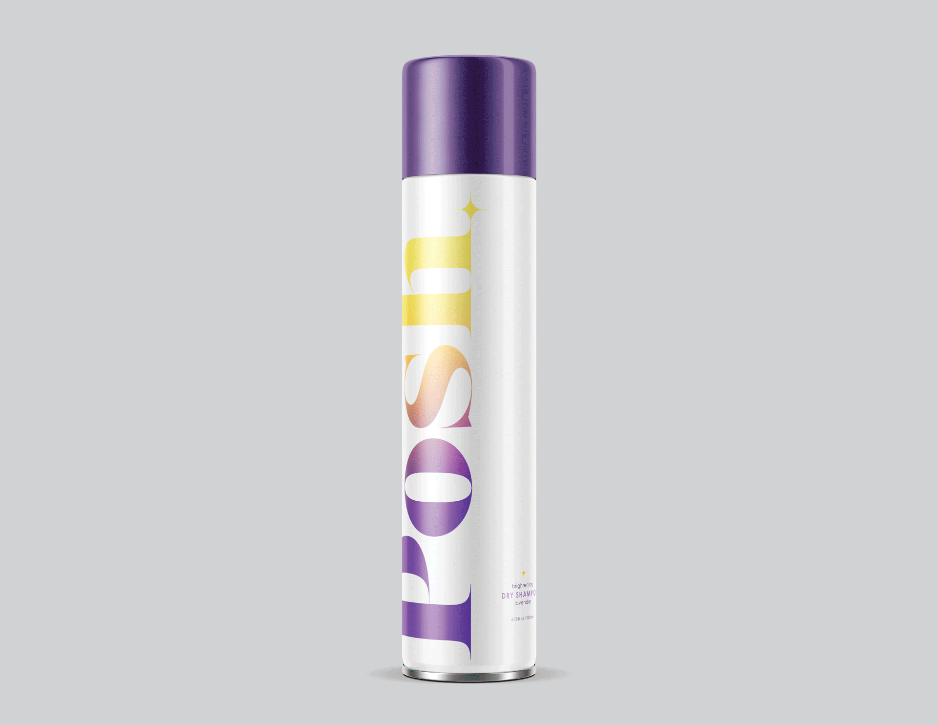
Posh.
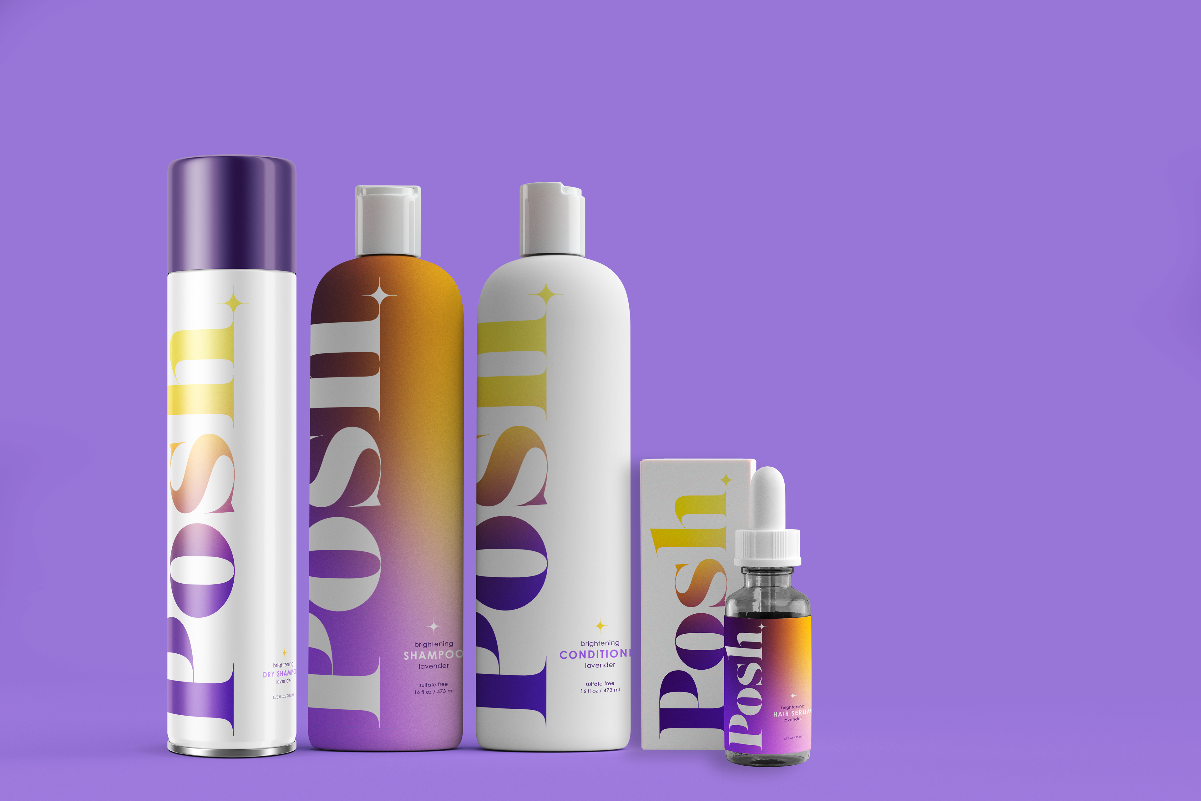
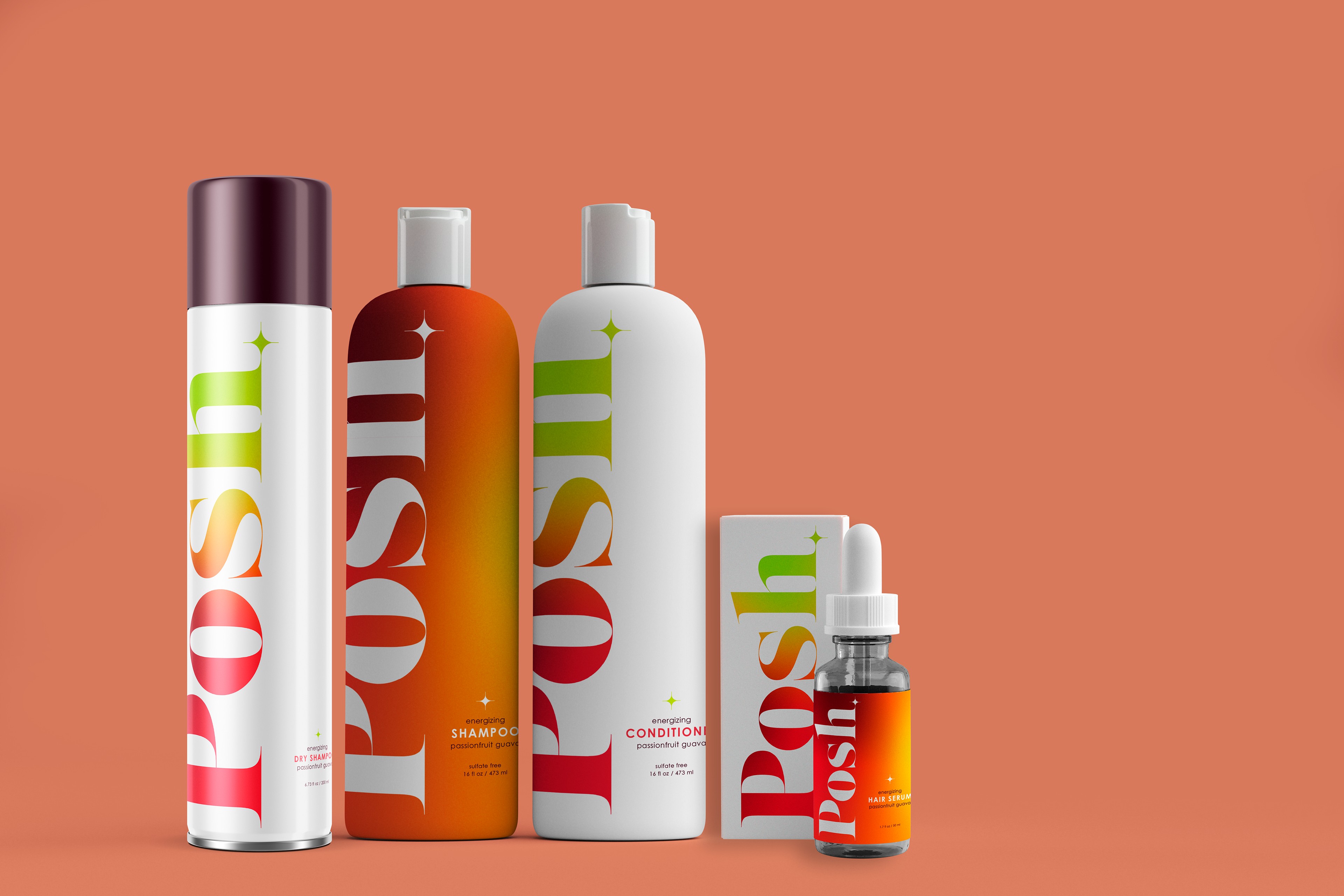
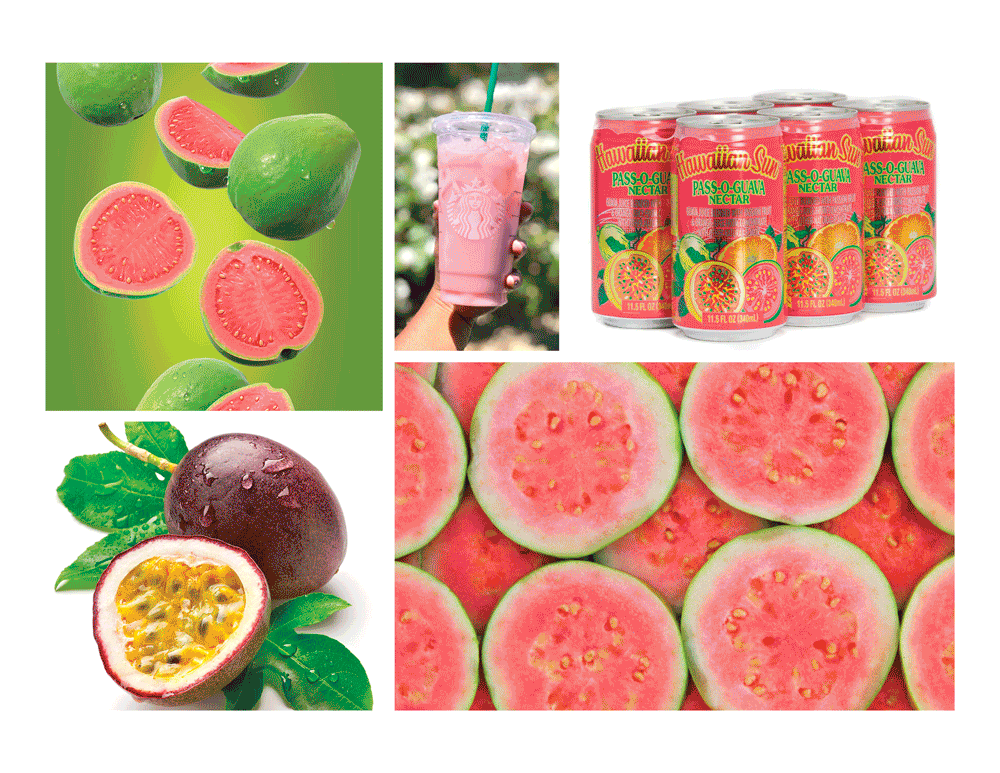
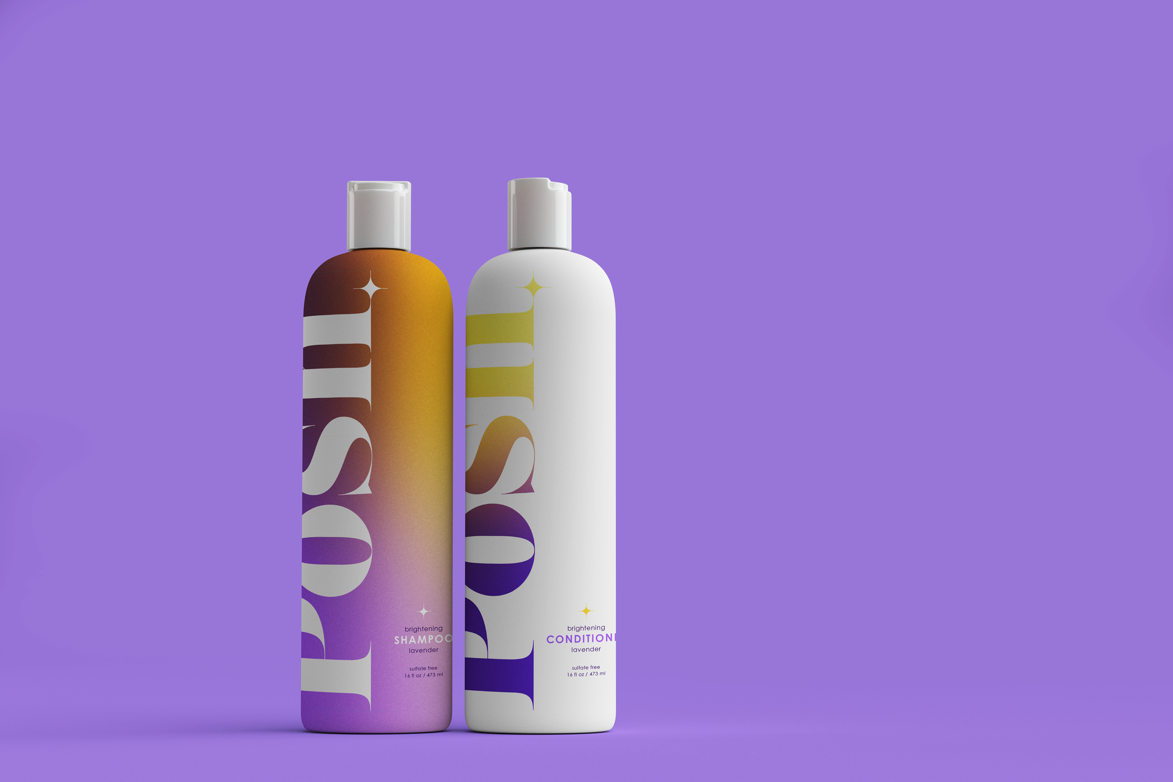
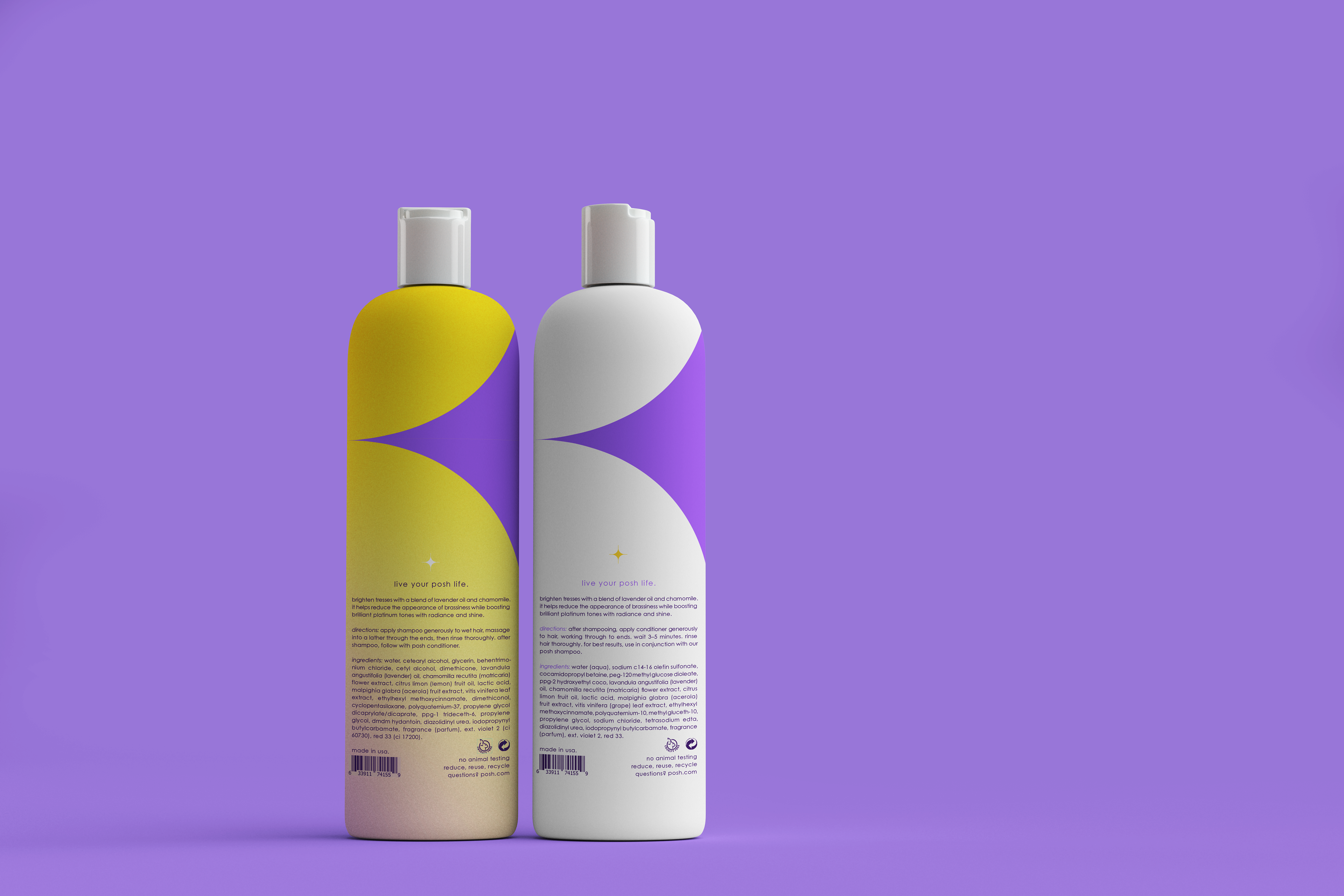
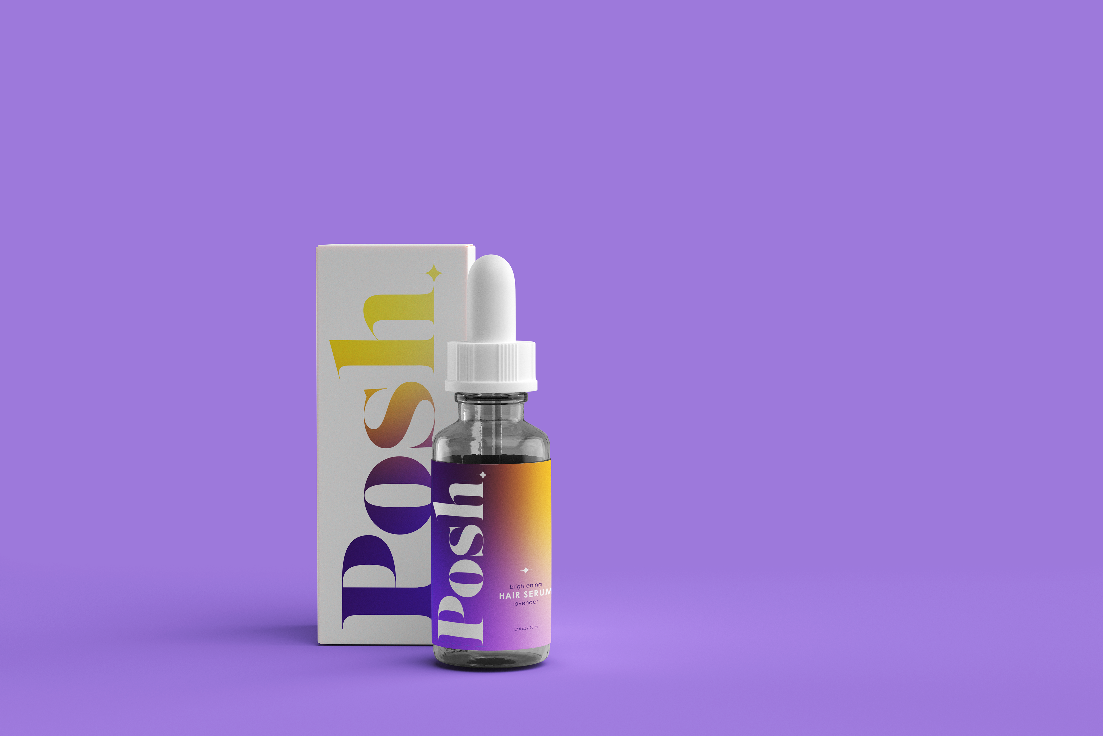
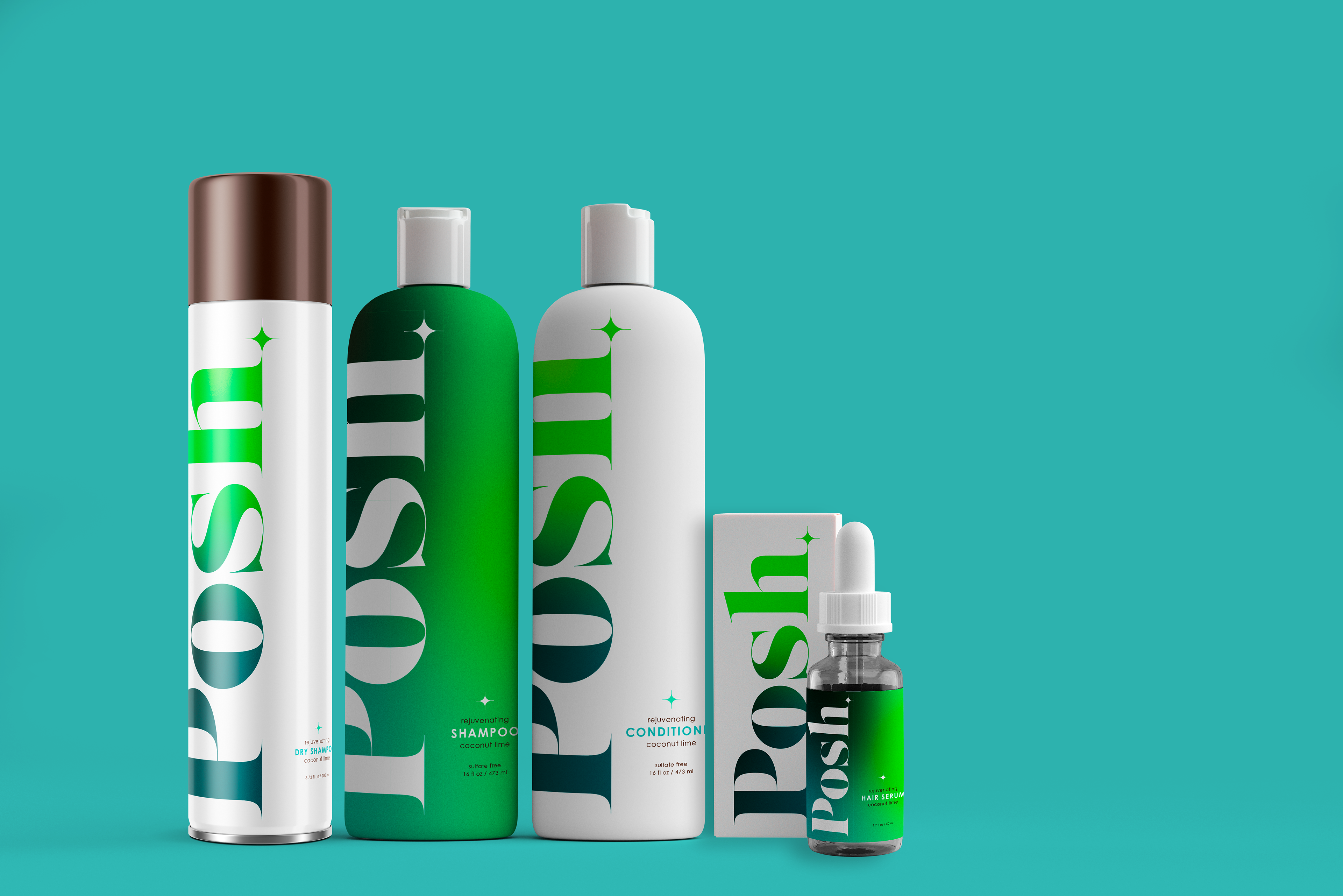
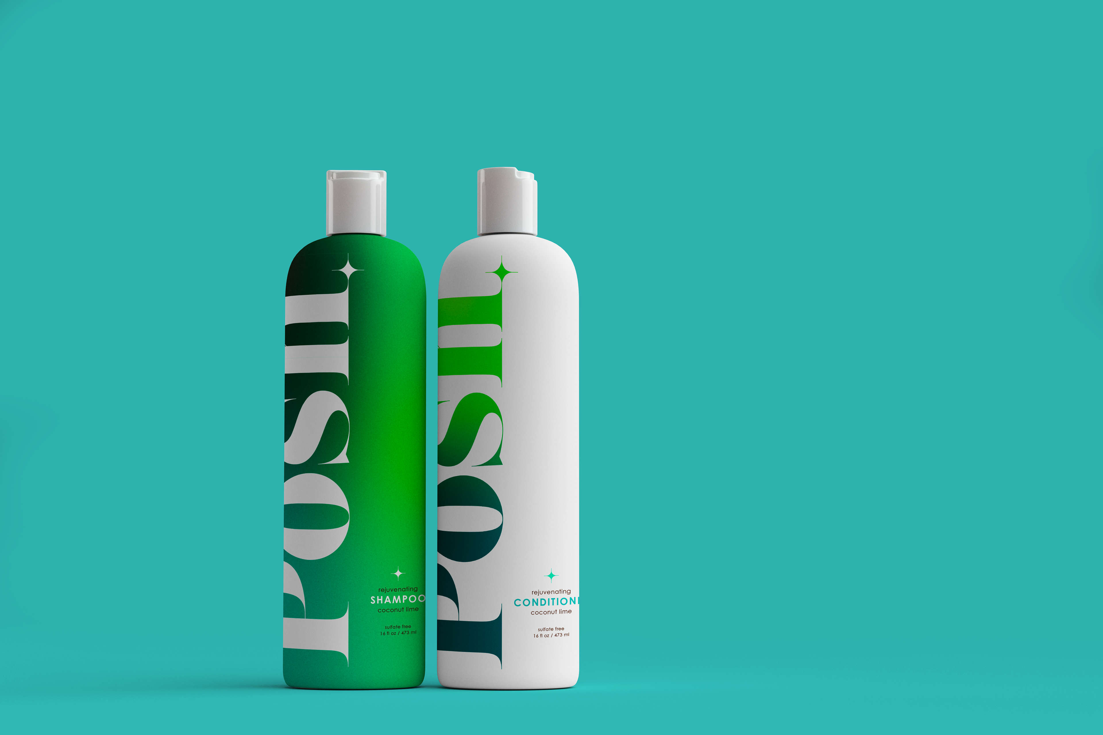
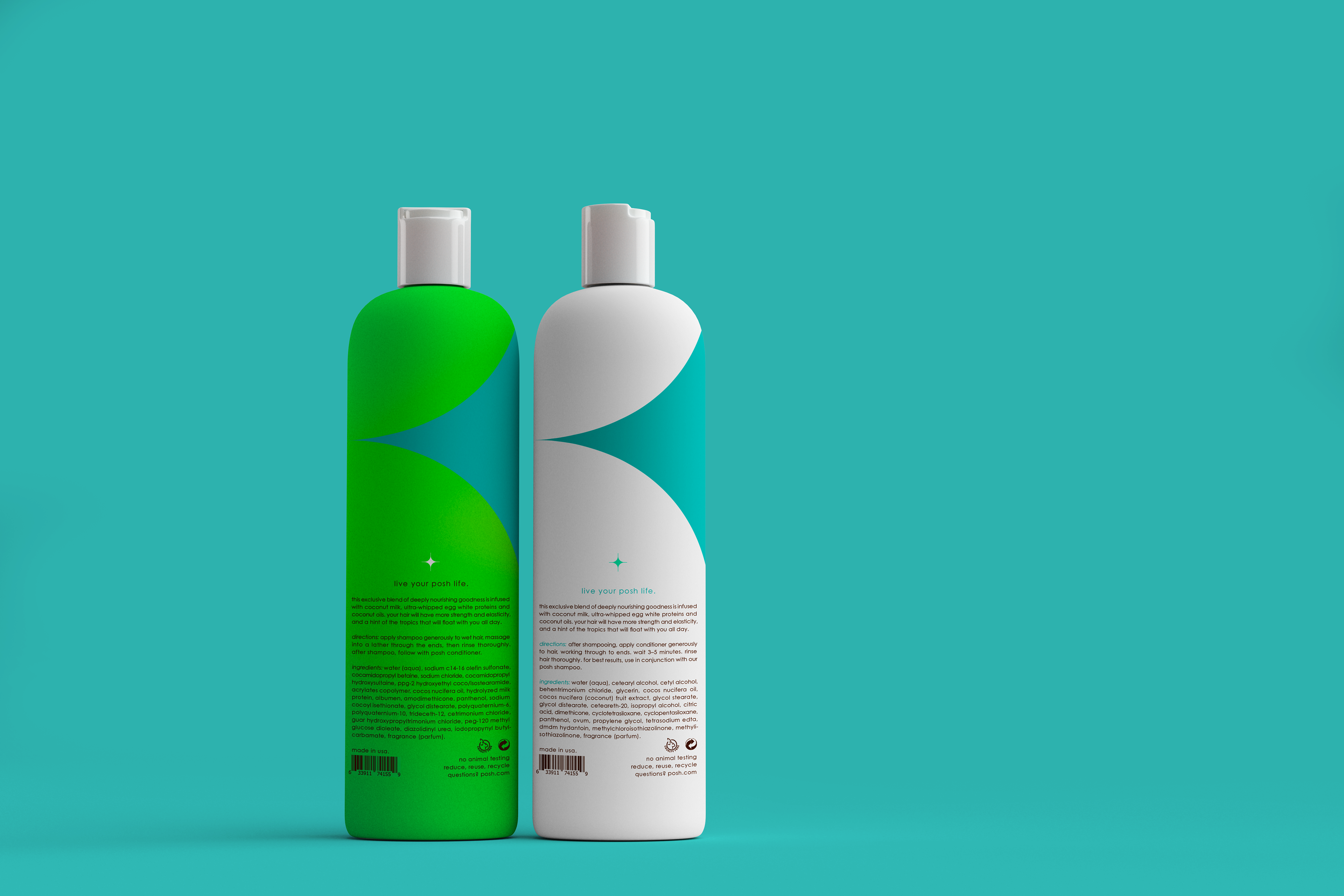
My primary goal for this project was advance my knowledge in an area that I am interested in pursuing professionally. I also wanted to emphasize some of my strengths, continue to learn new design techniques and challenge myself to leave my comfort zone. The plan for this project was to design the packaging for a hair care line. This line includes a shampoo, conditioner, dry shampoo, and hair serum. This gave me the opportunity to apply a packaging design system to multiple different bottle shapes. There are three different scents that target different hair goals; energizing passionfruit guava, brightening lemon lavender, and rejuvenating coconut lime. After researching contemporary packaging design, I noticed that bold colds and bold typography are very "in" right now. A lot of the trends feature simplicity, but also pack a punch and are quite impactful. Another prominent trend in 2021 is the use of grainy gradients. I have never tried designing with gradients, so it was extremely fun to experiment and try something new to me. The goal was to design something that stood out from my typical "design style," and Posh successfully does that.
I chose the name Posh for this line because the word posh means elegant and fashionable, which is very relevant to hair care. The main concept in this design was to use color psychology and color theory effectively to convey a connection and certain feeling for each different scent. Take a look at the GIF below to see the color psychology behind my choices.
RESEARCH & PROCESS HERE.


WARNING: The following GIF may potentially trigger seizures for people with photosensitive epilepsy. Viewer discretion is advised.