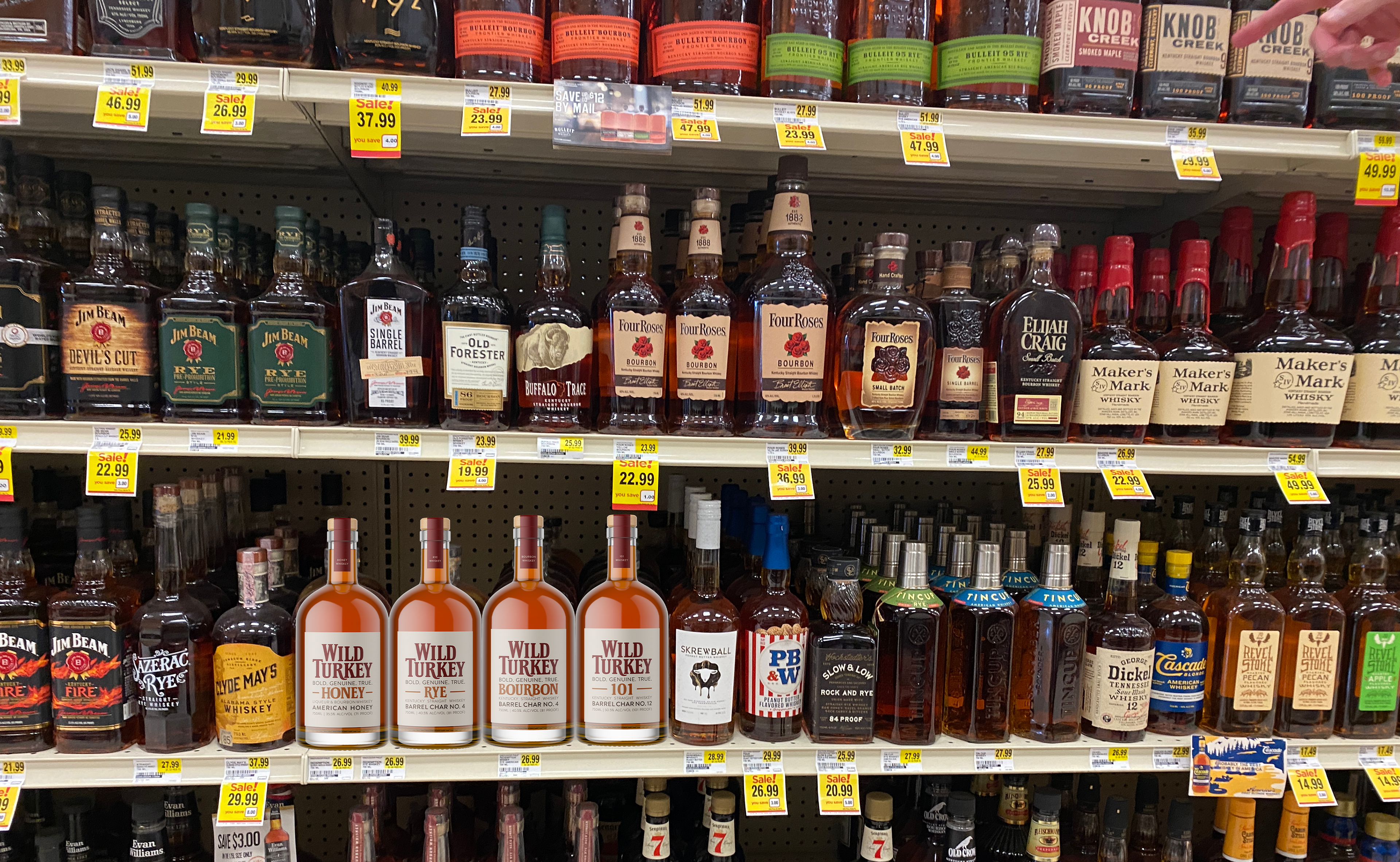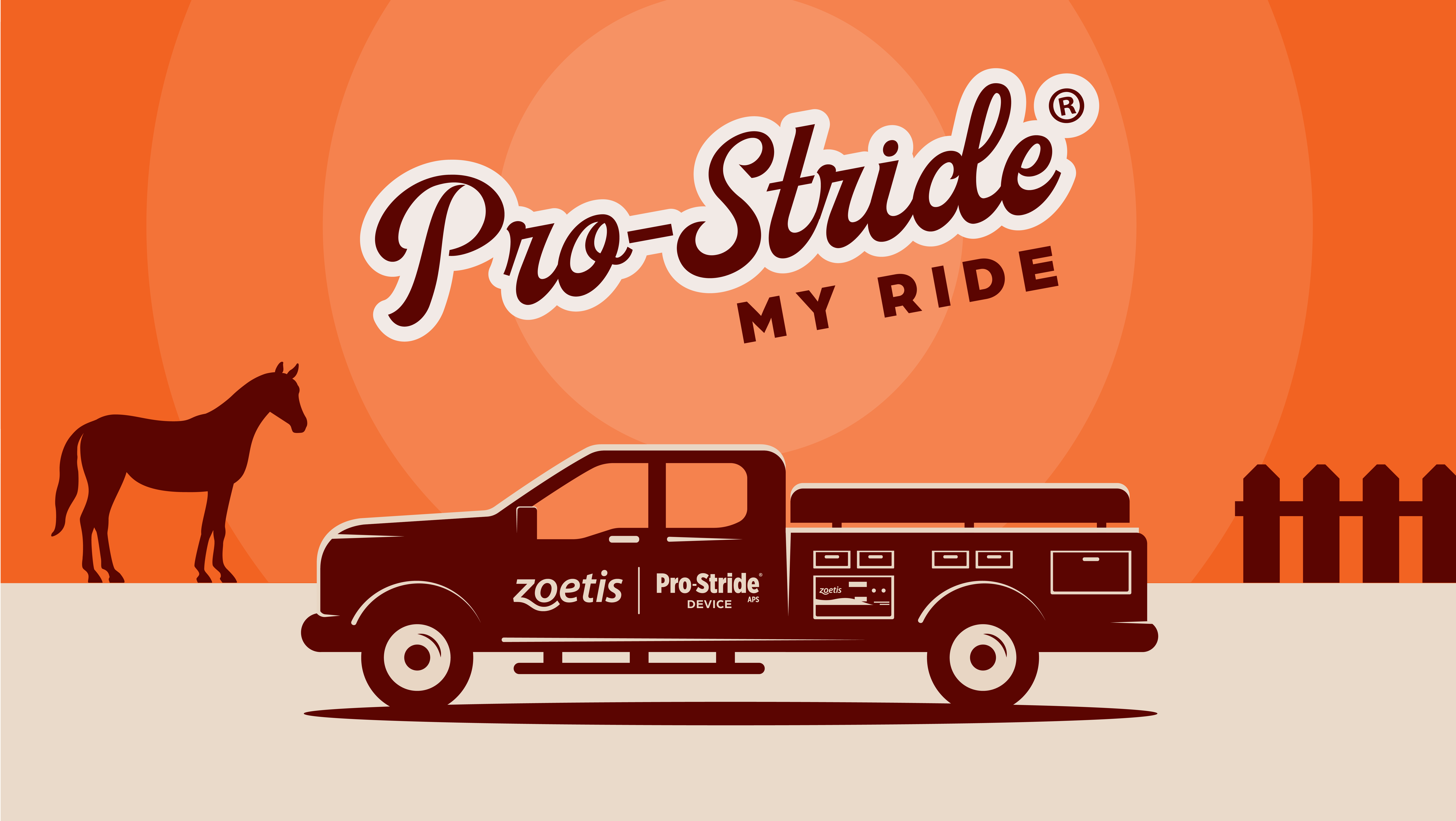
Wild Turkey Whiskey Packaging
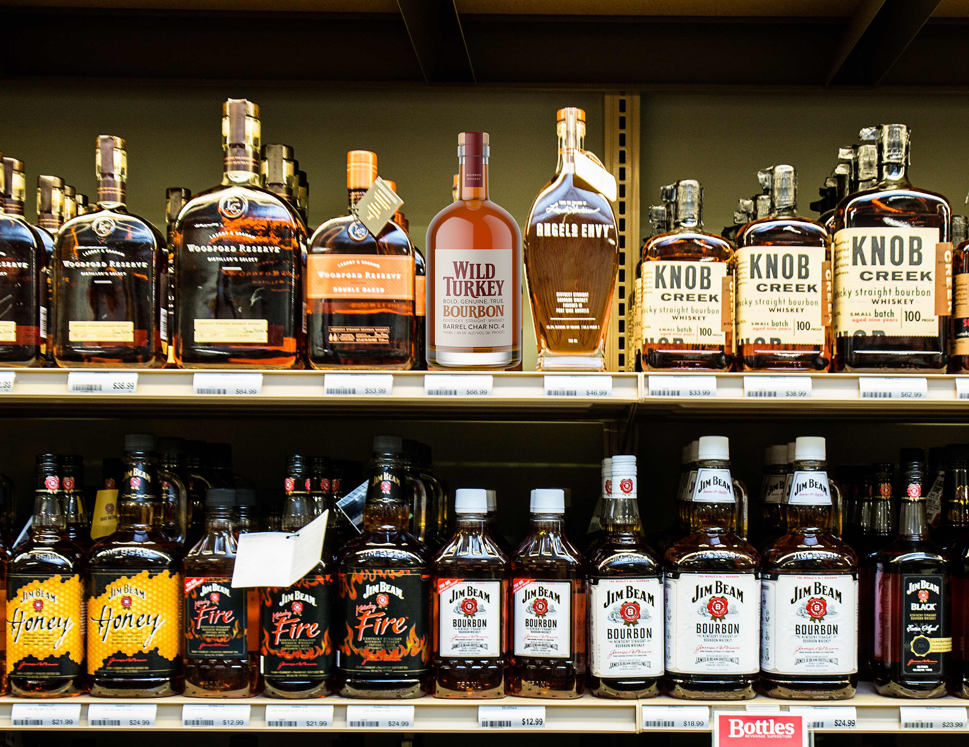
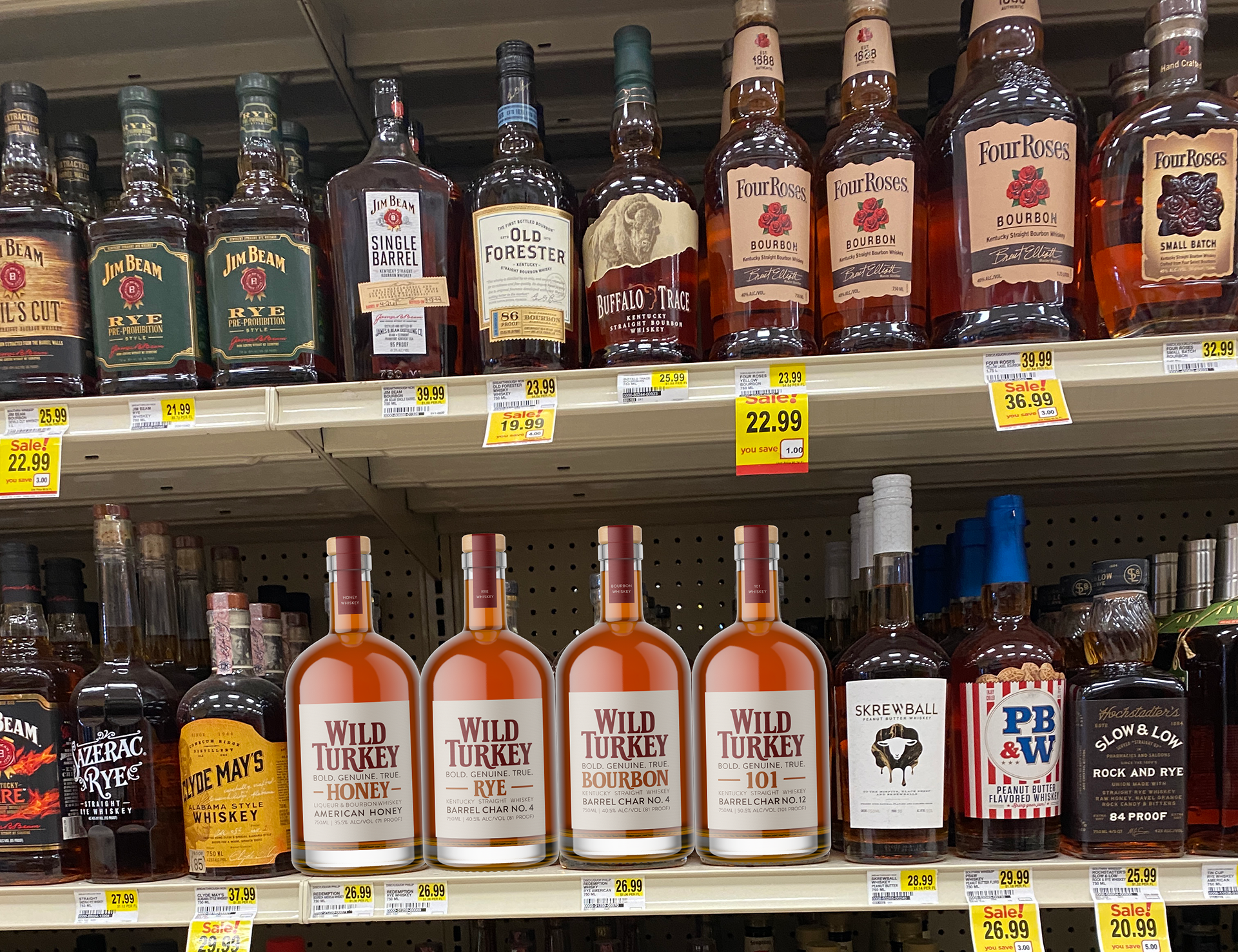
When I first turned 21, I remember walking into the liquor store for the first time and being overwhelmed by all of the different options. Since that first time 5 years ago, I have noticed that a lot of the brands have upped their game in the packaging department.
It started becoming more notable specifically during the rise of craft beers. I’ve noticed that I gravitate towards brands that have the better designs, which I think is very interesting. When at the liquor store, I find myself spending a lot of time exploring and admiring the packaging. With that being said, I have recently been intrigued with trying my hand at rebranding packaging for some sort of alcoholic beverage and see this as the perfect opportunity to do so!
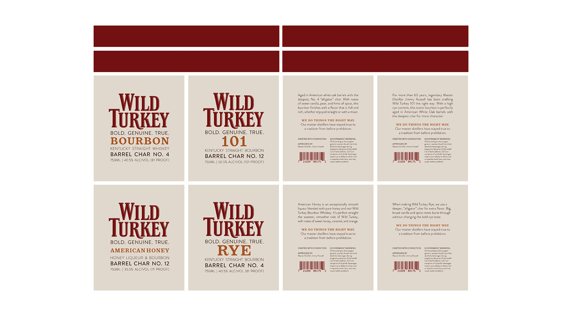
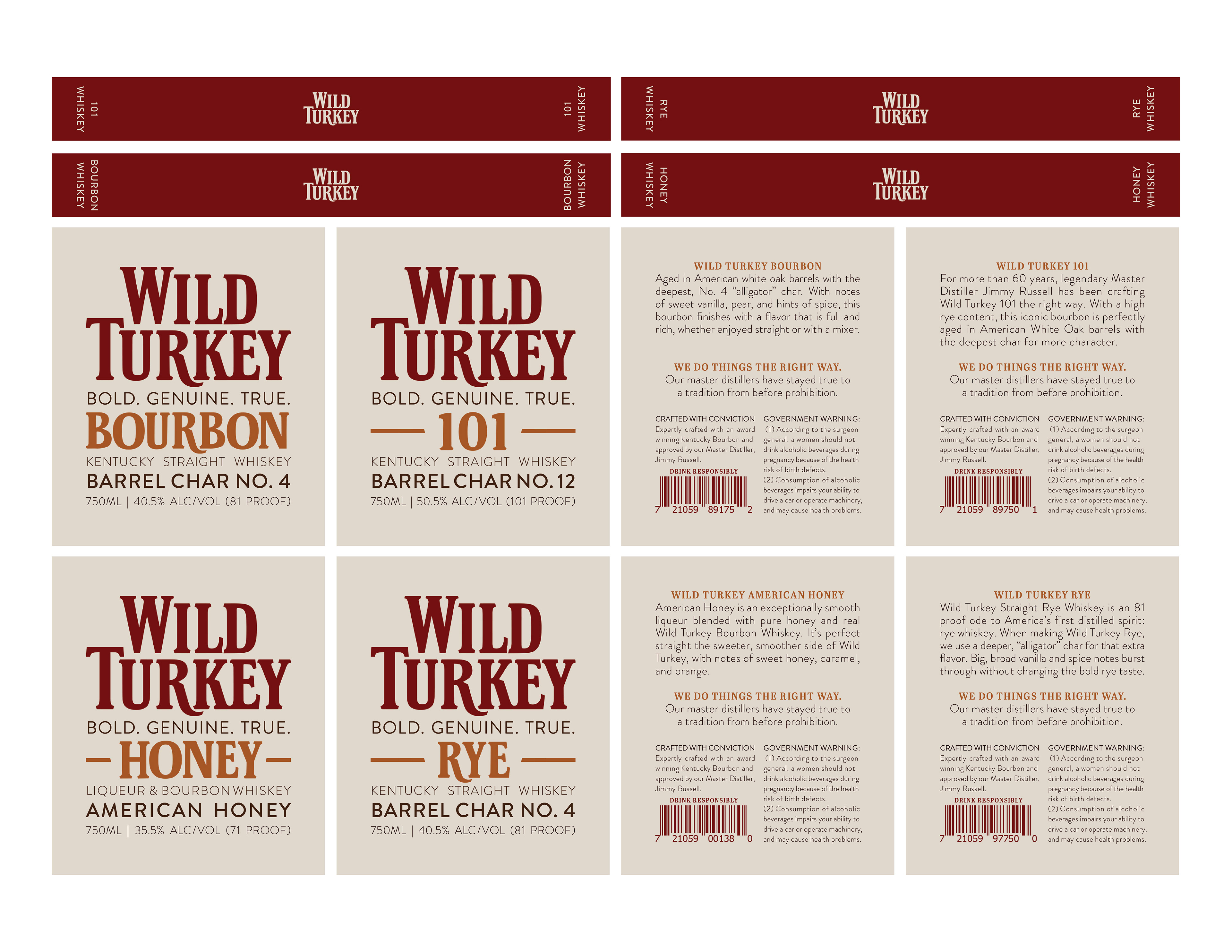
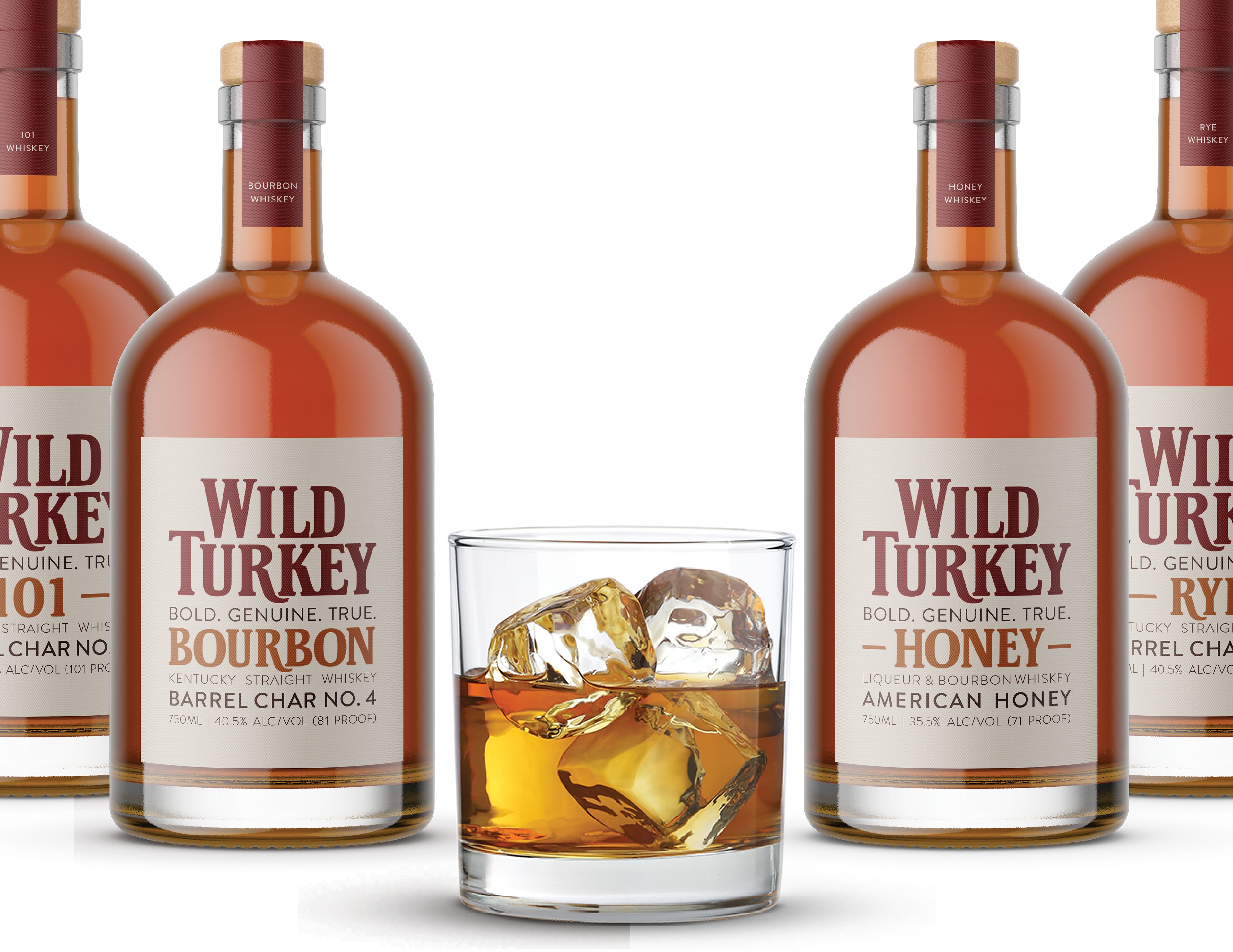
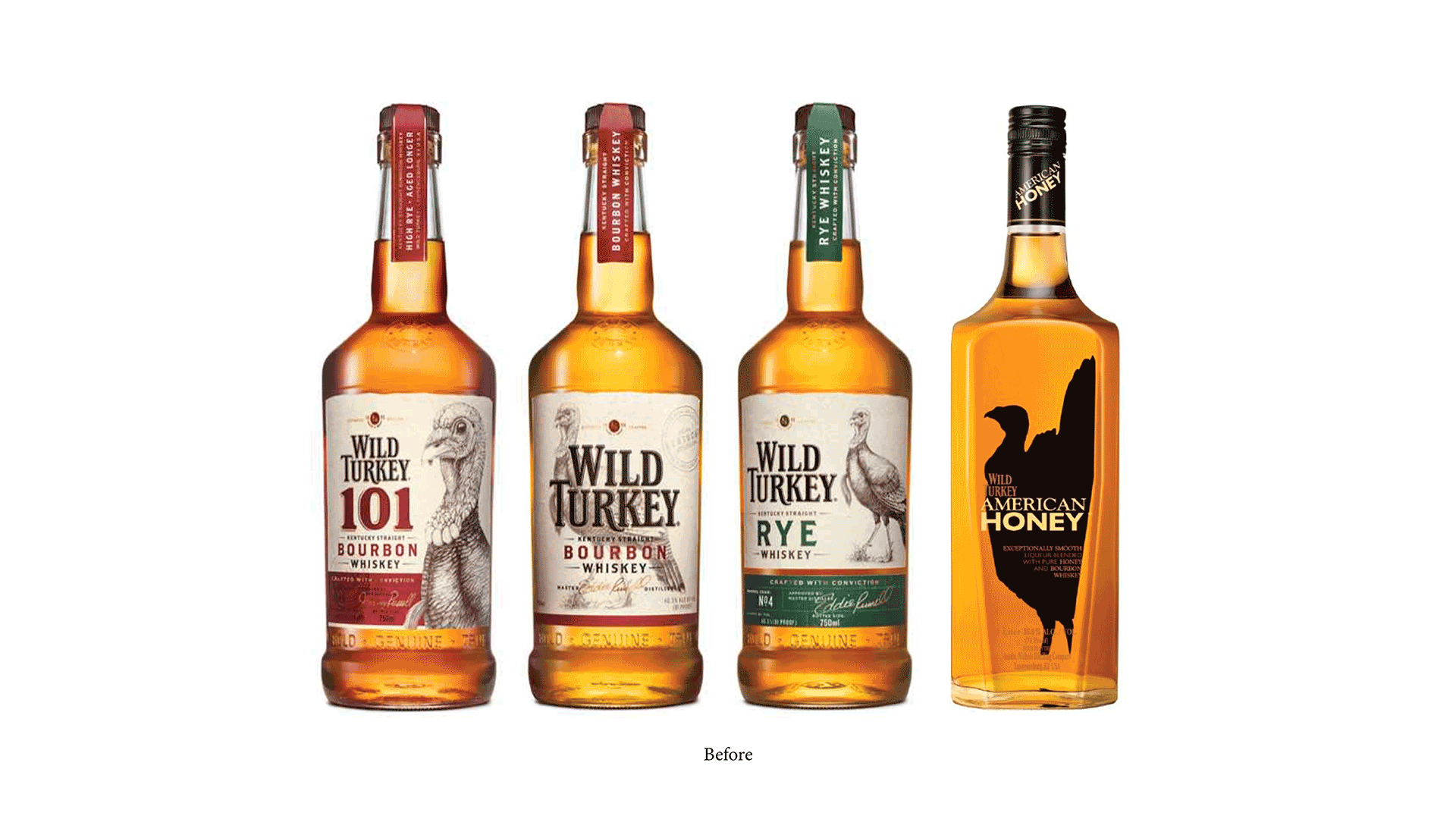
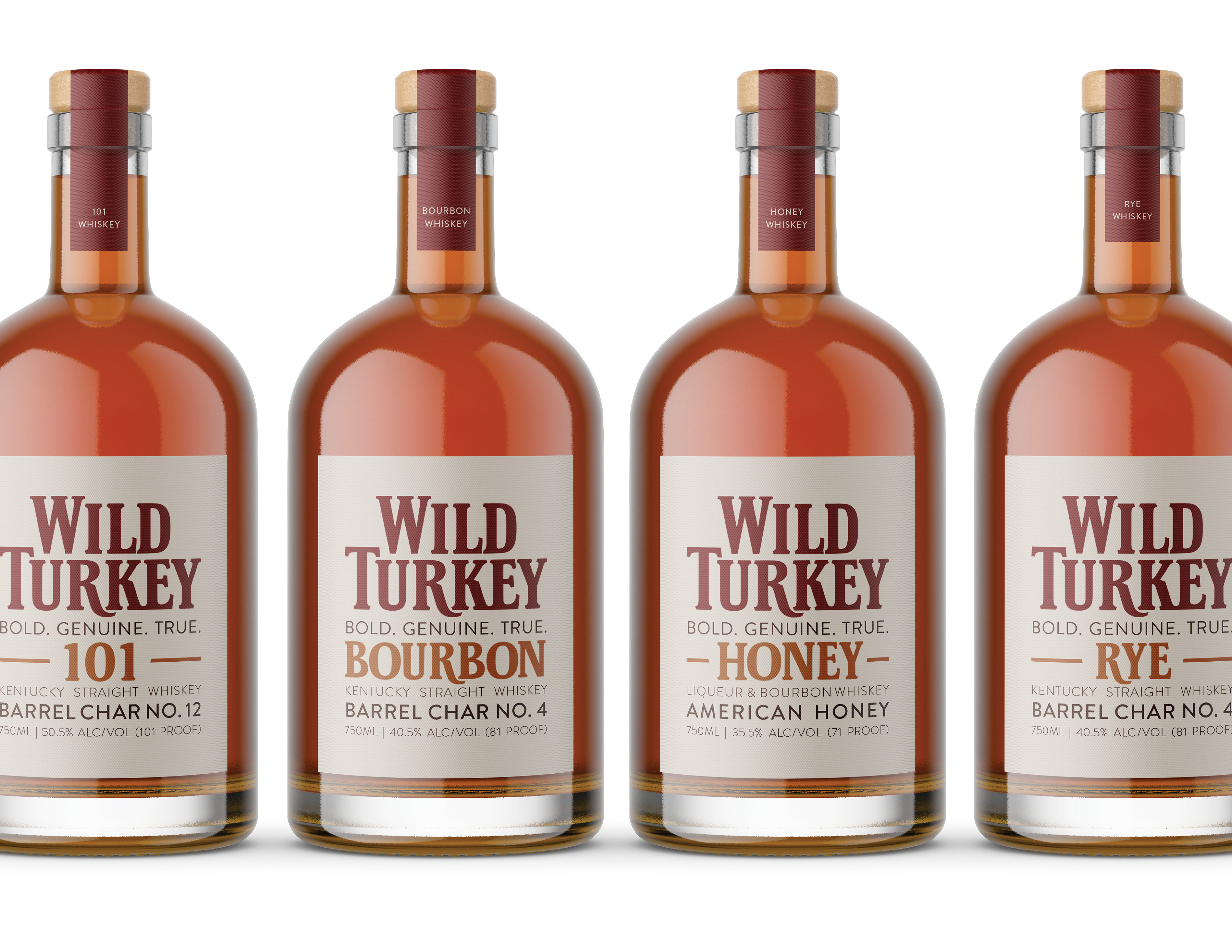
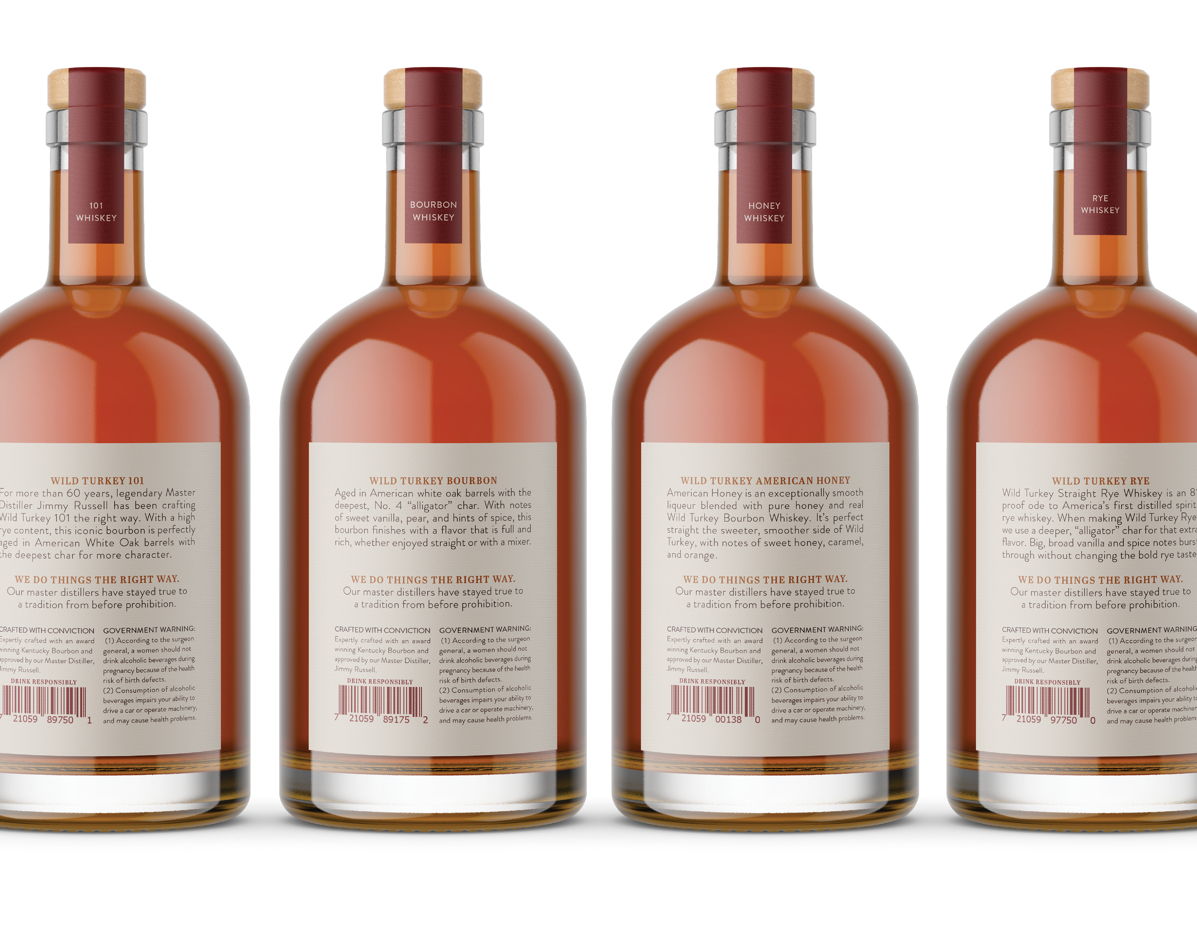
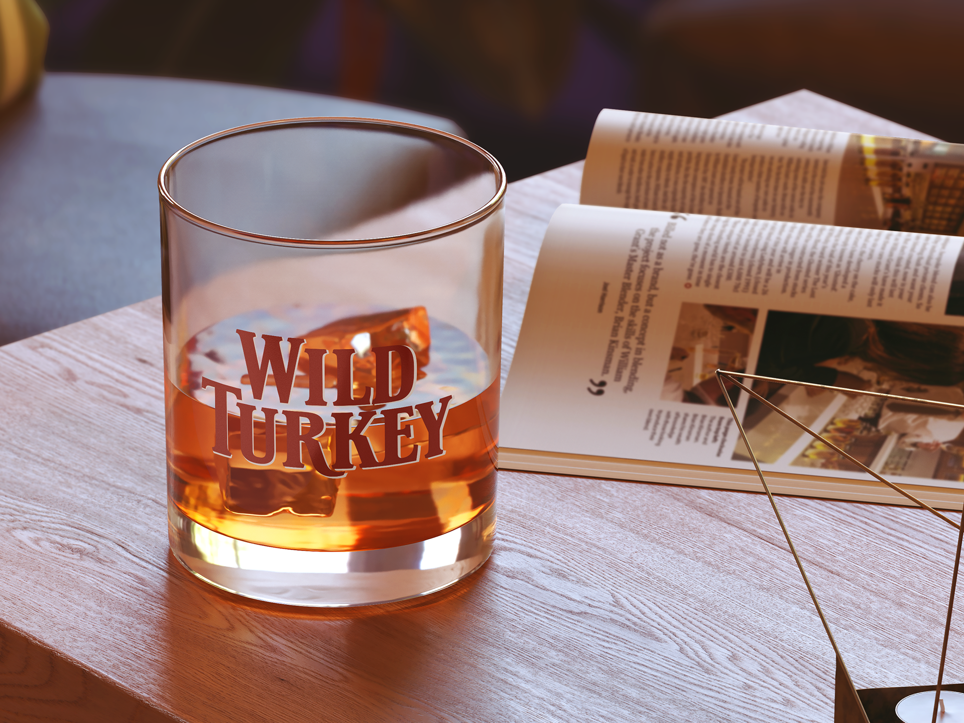
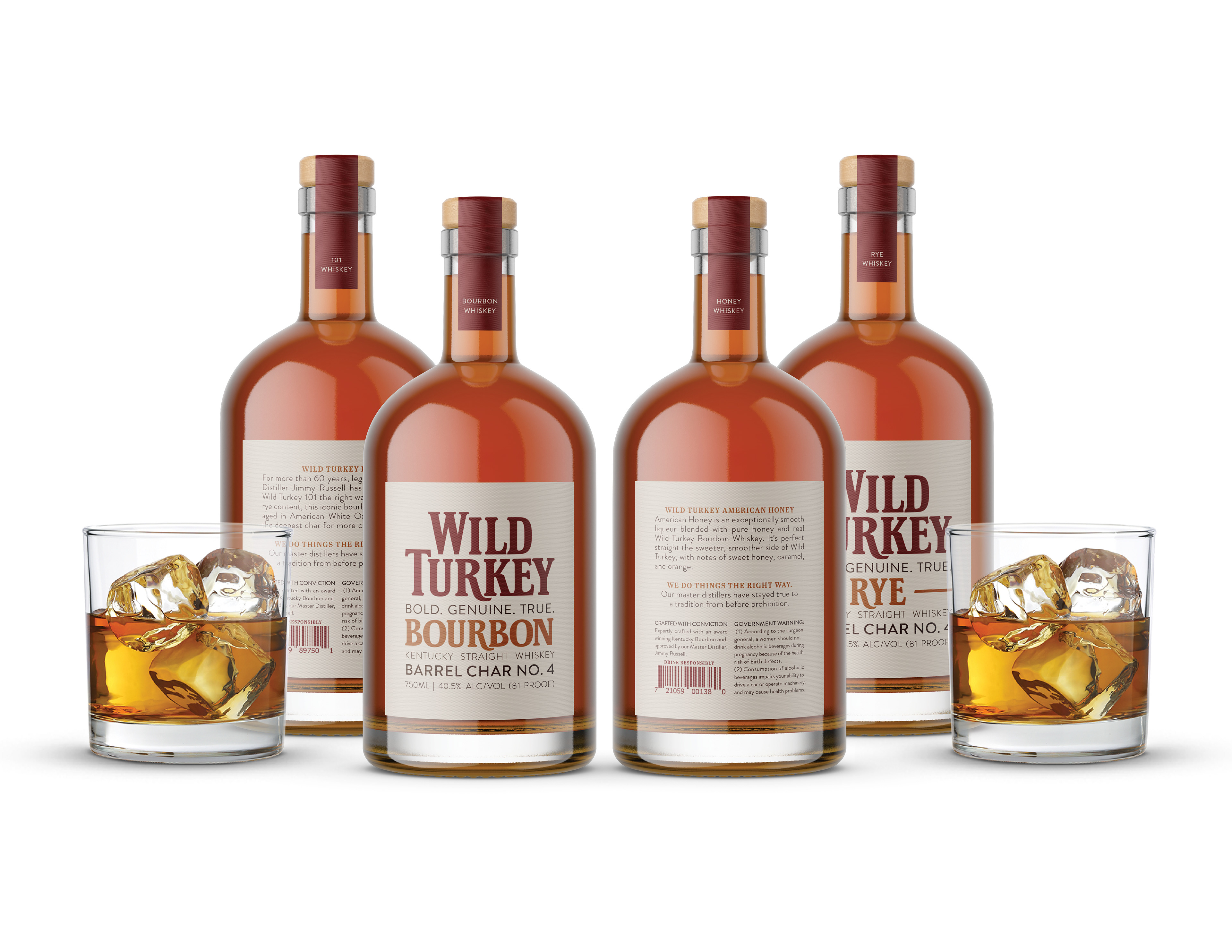
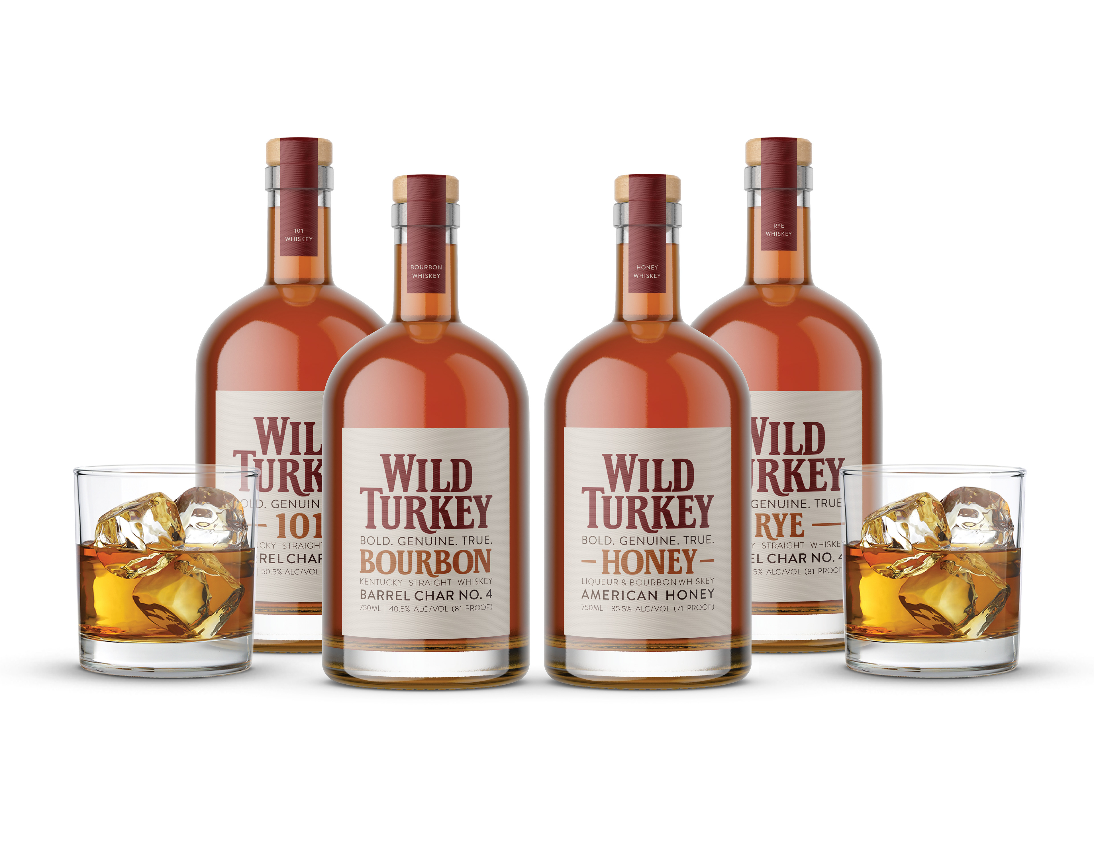
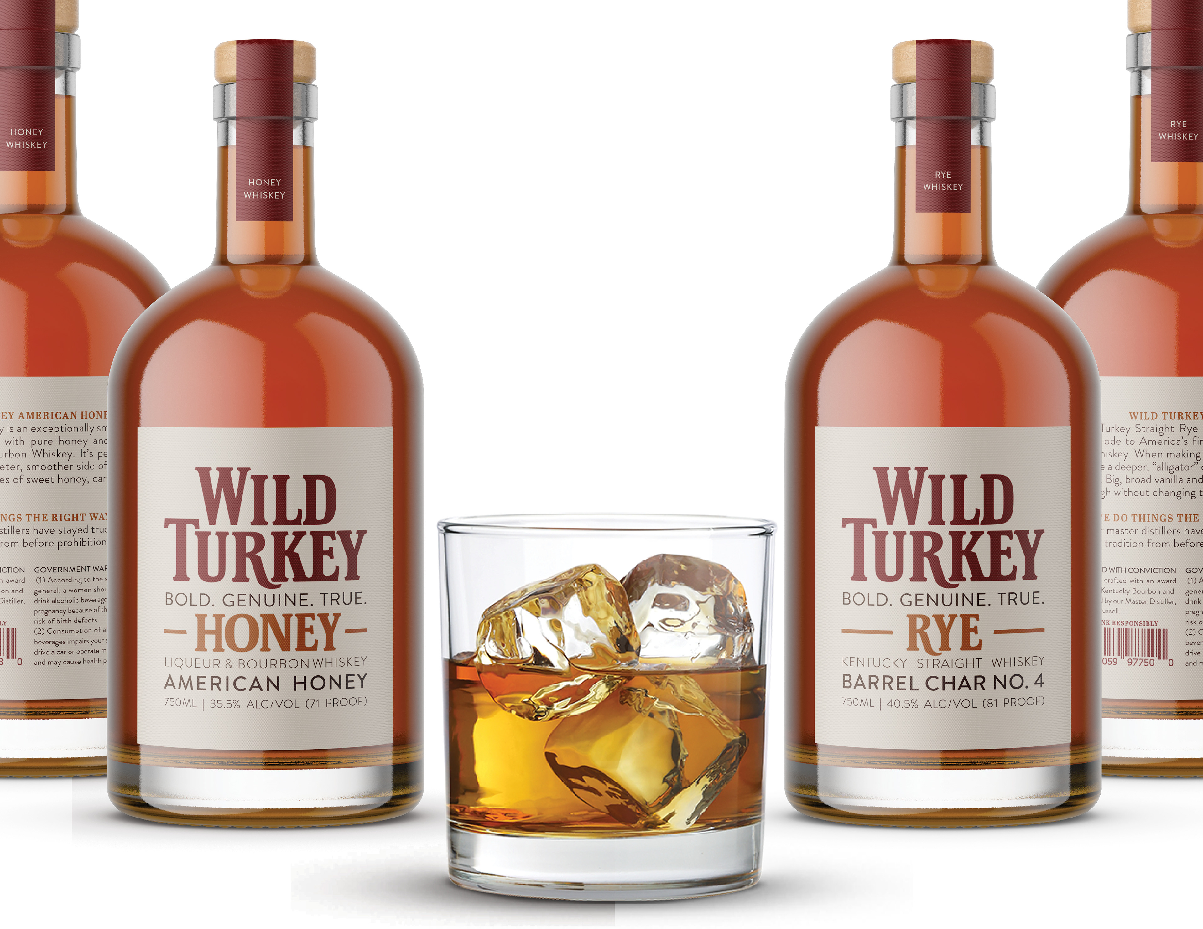
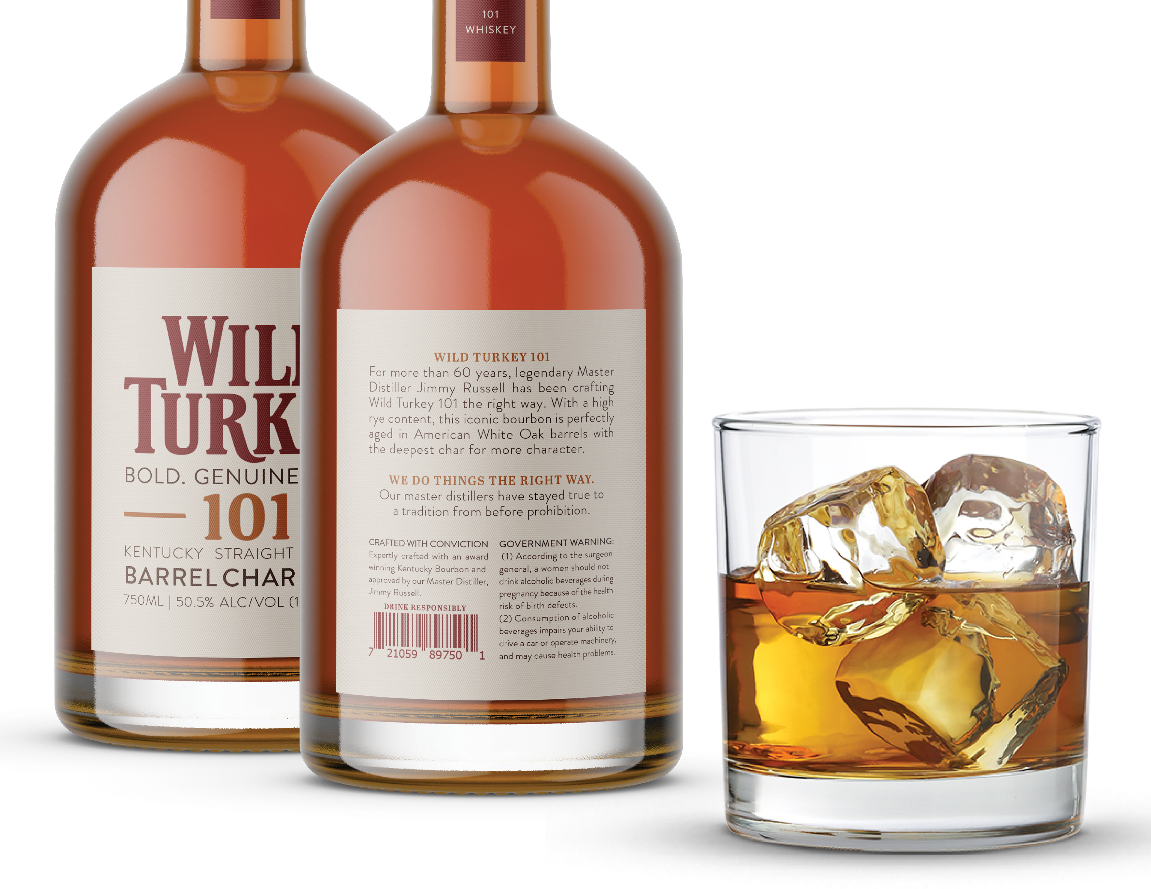
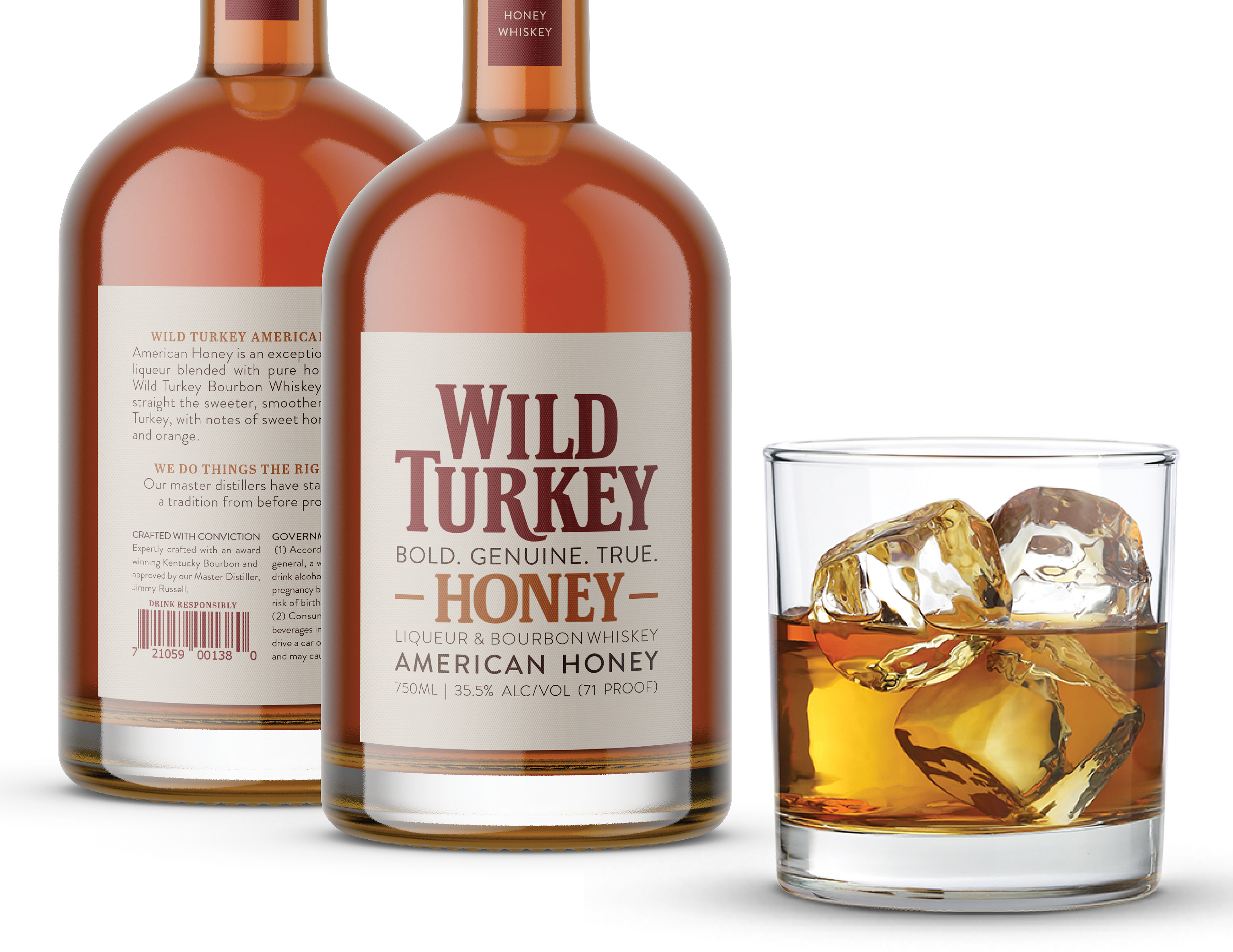
With this redesign I wanted to stay true to the classic Wild Turkey roots, but modernize the packaging and make it feel fresh and new while maintaining that nostalgic feel. My idea was to do this by combining a more modern looking sans serif and a rustic feeling slab serif in a typographic lockup. I also kept the familiar logo with a little bit of simplification and worked with a color palette that is similar to the current Wild Turkey branding. An important thing to remember when choosing a color palette is that the whiskey itself is a design element and color palette due to the transparent nature of the bottle. This element led me to decide to use a warm toned palette to mirror the deep, warm toned whiskey that will be in the bottle. I chose an analogous scheme to harmonize with the whiskey and make it seem more cohesive. Similar colors were used in past packaging design by Wild Turkey, so this also maintains homage to the roots of Wild Turkey as a brand.
*Recipient of 2021 American Package Design Award from GDUSA.
RESEARCH AND PROCESS HERE.
Logo Progression:


Draft Progression: