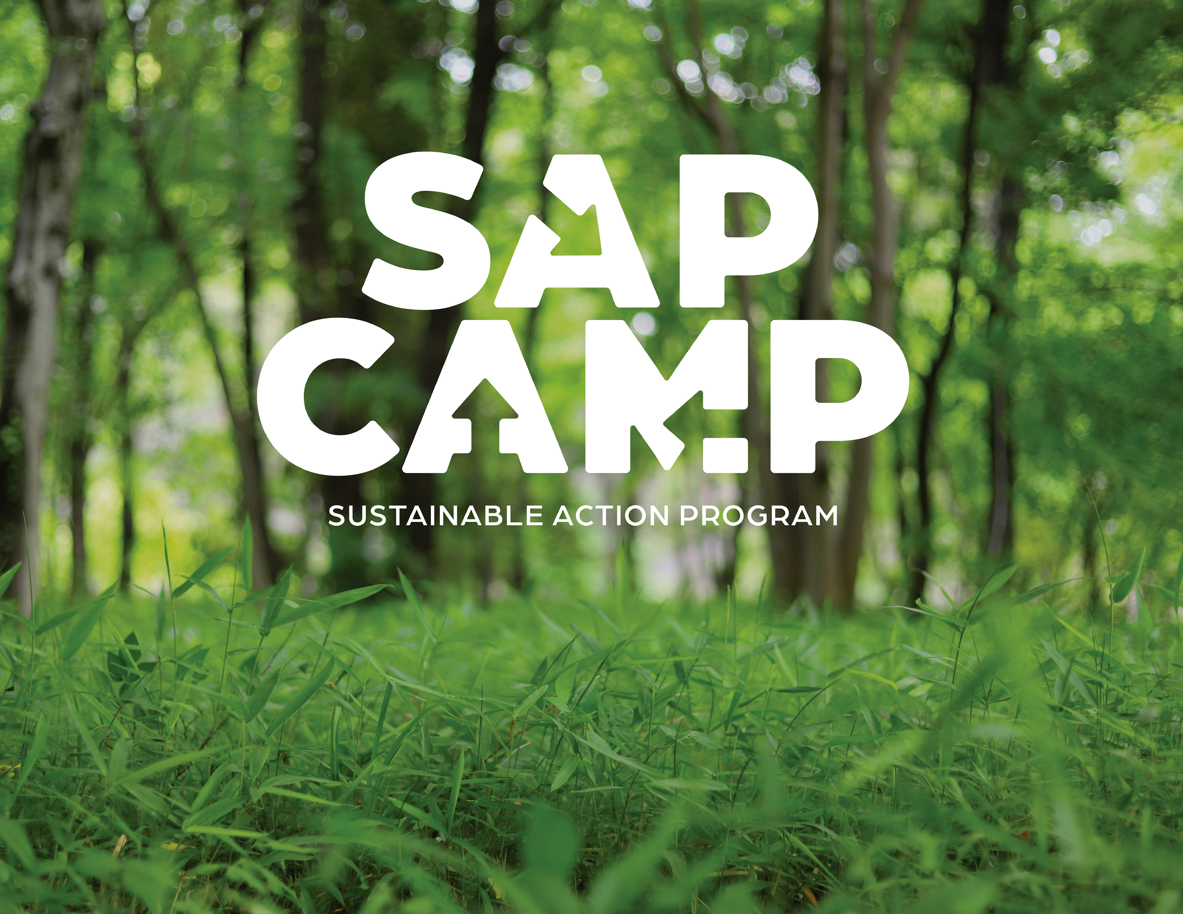
SAP Camp Branding
The project was to design an identity and branding strategy for a project or cause (of your own invention) that, through design, addresses a pressing social issue and demonstrates the value of design in a clear, compelling and accessible way. The social issue should reflect your personal passions and interests. You are encouraged to apply design thinking – the combination of unleashed creativity and executable actions – to a problem you are intimately familiar with.
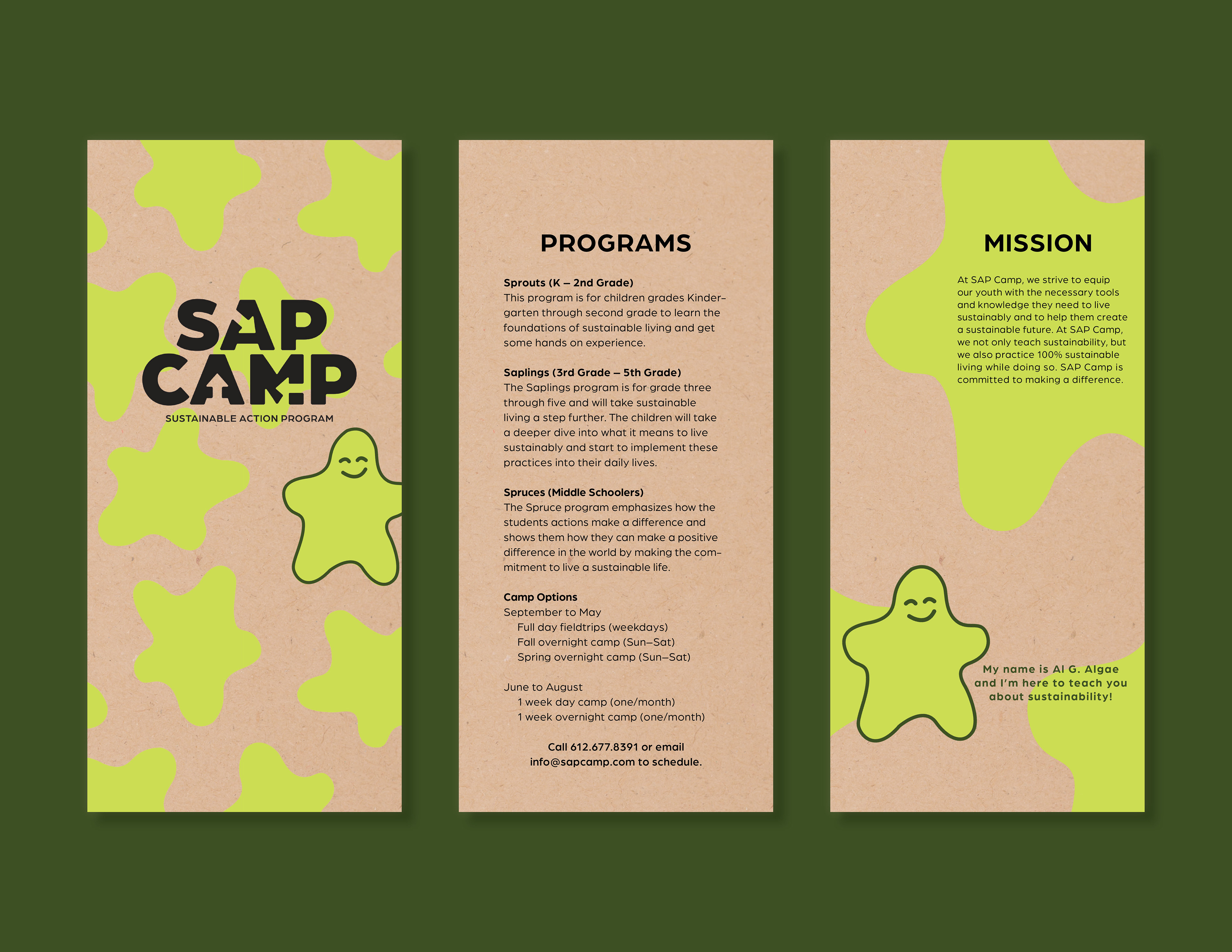
I am a huge advocate for the environment. I went to an environmentally-focused high school and was pursuing a degree in Fisheries and Wildlife before my switch to Graphic Design. At Design Camp, there was a workshop where I learned that sustainable design is something you can study and get a Master’s degree in, which I thought was extremely cool and re-ignited my interest and enthusiasm for sustainability. In the current state of the world, sustainability is important. The goal of this project would be to develop a nonprofit that teaches sustainability, primarily to children so we can teach them a foundation of sustainability because it will become more and more of an issue during their lifetime. I also want there to be a program that would target older generations as well, to get them up to speed on what is new in terms of living sustainably and how they can make an impact.
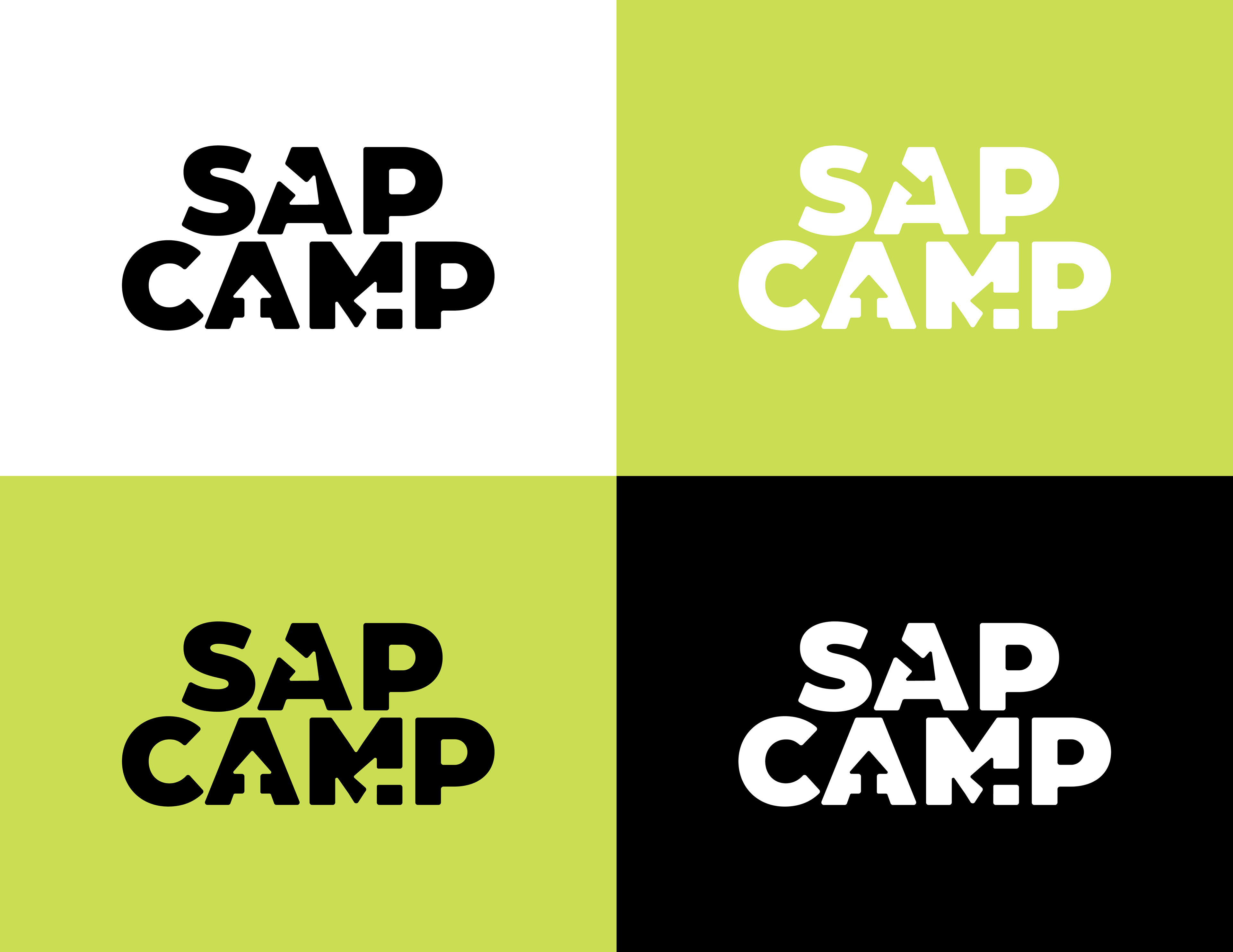
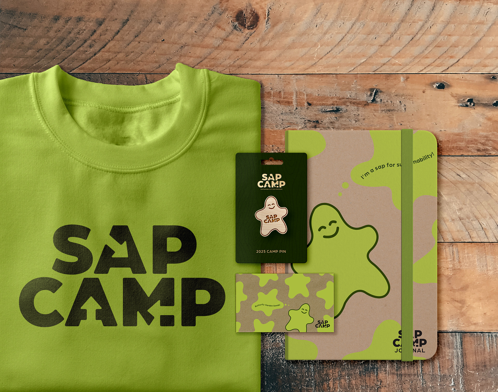
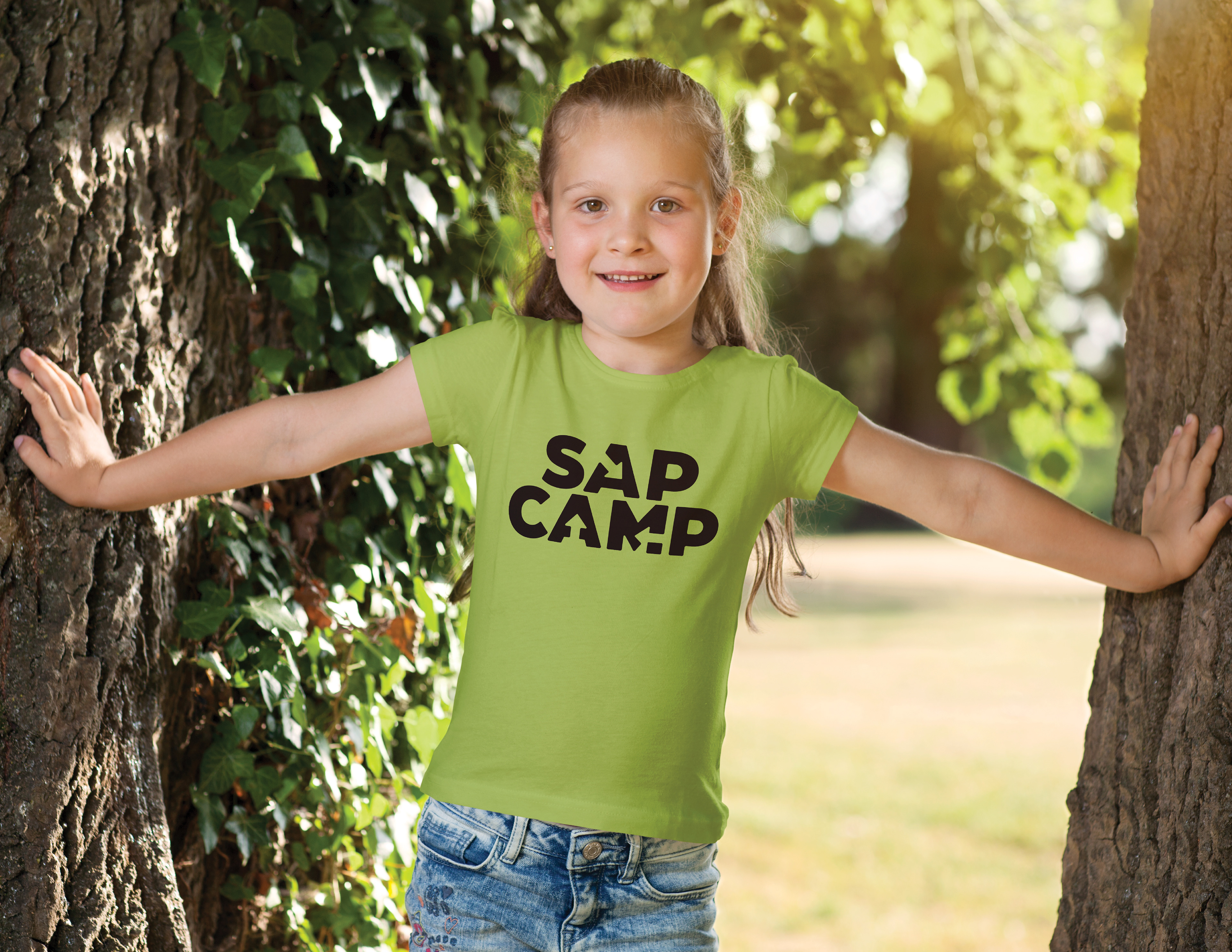
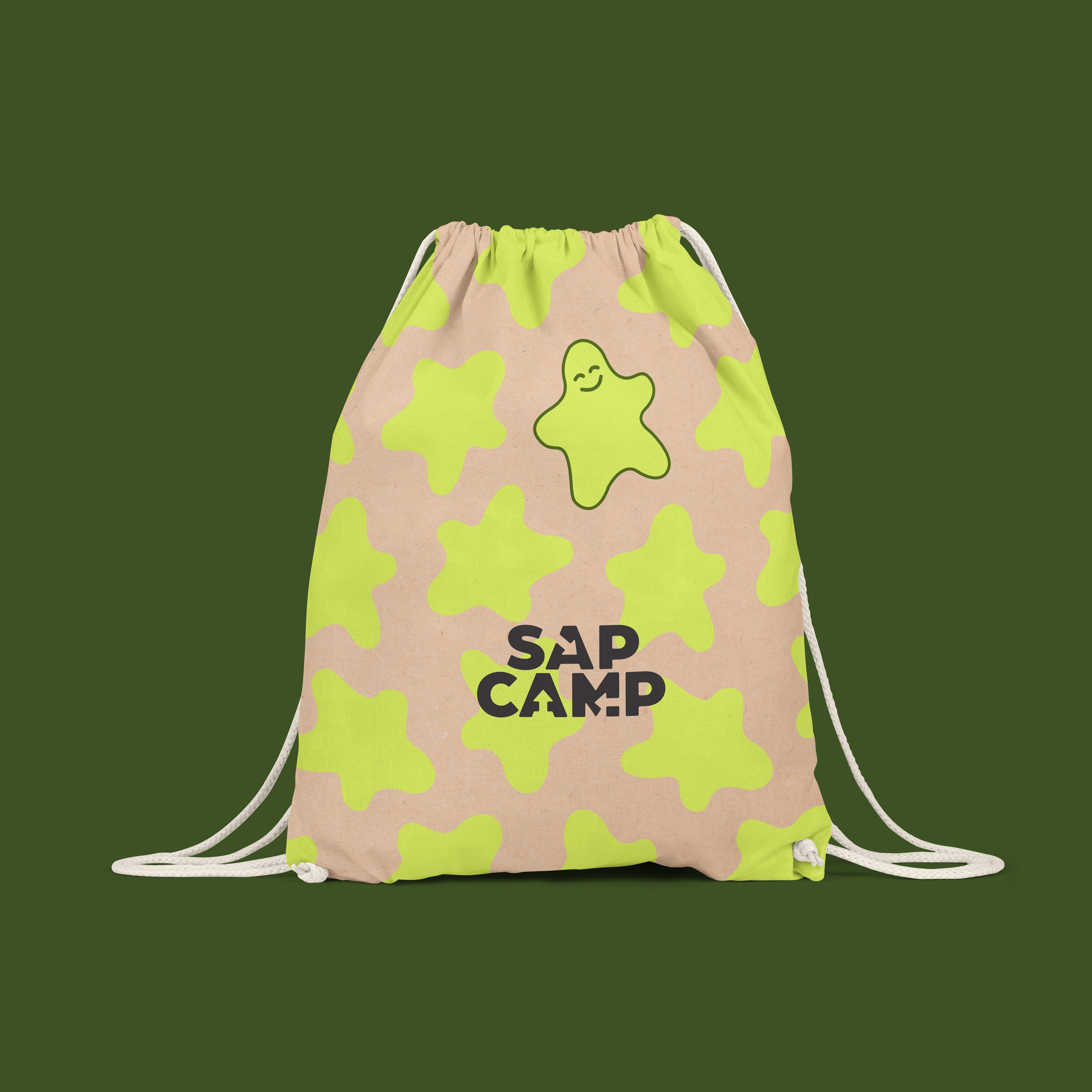
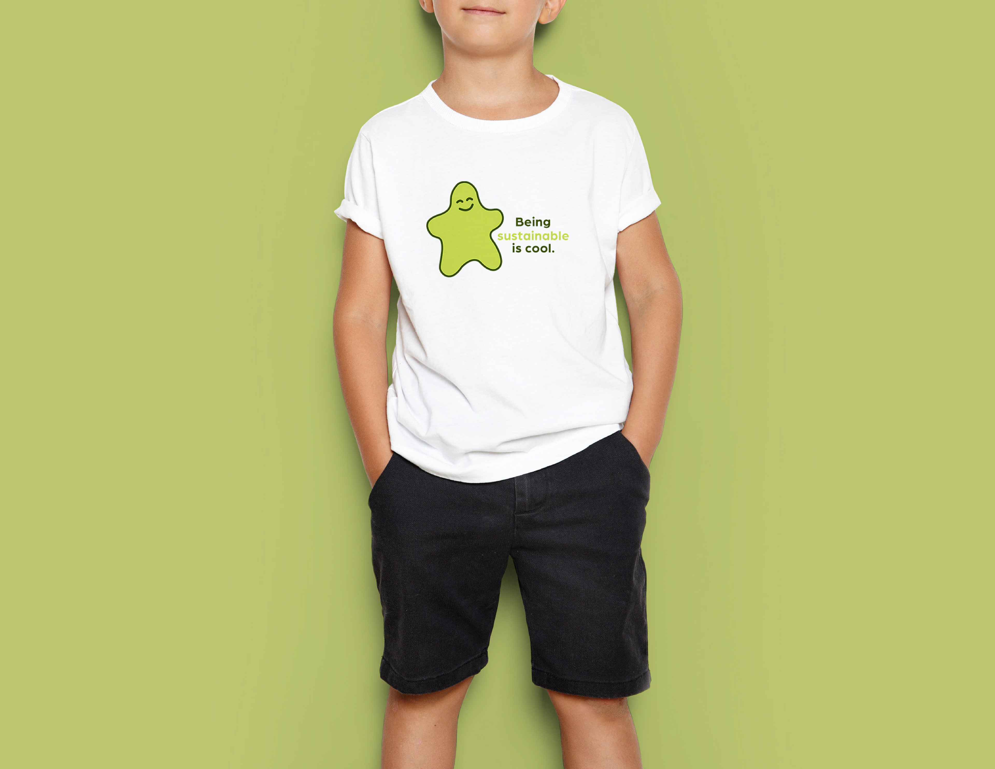
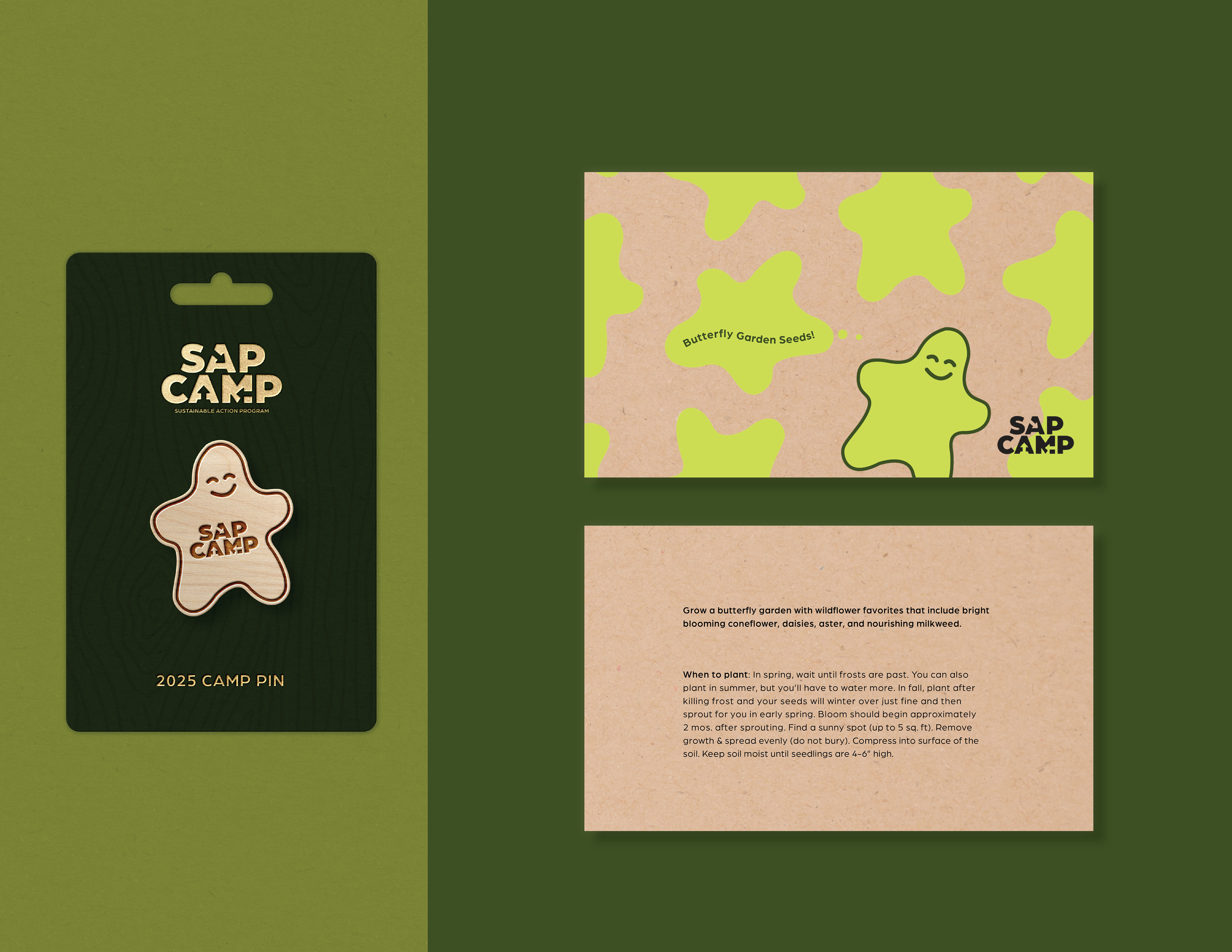
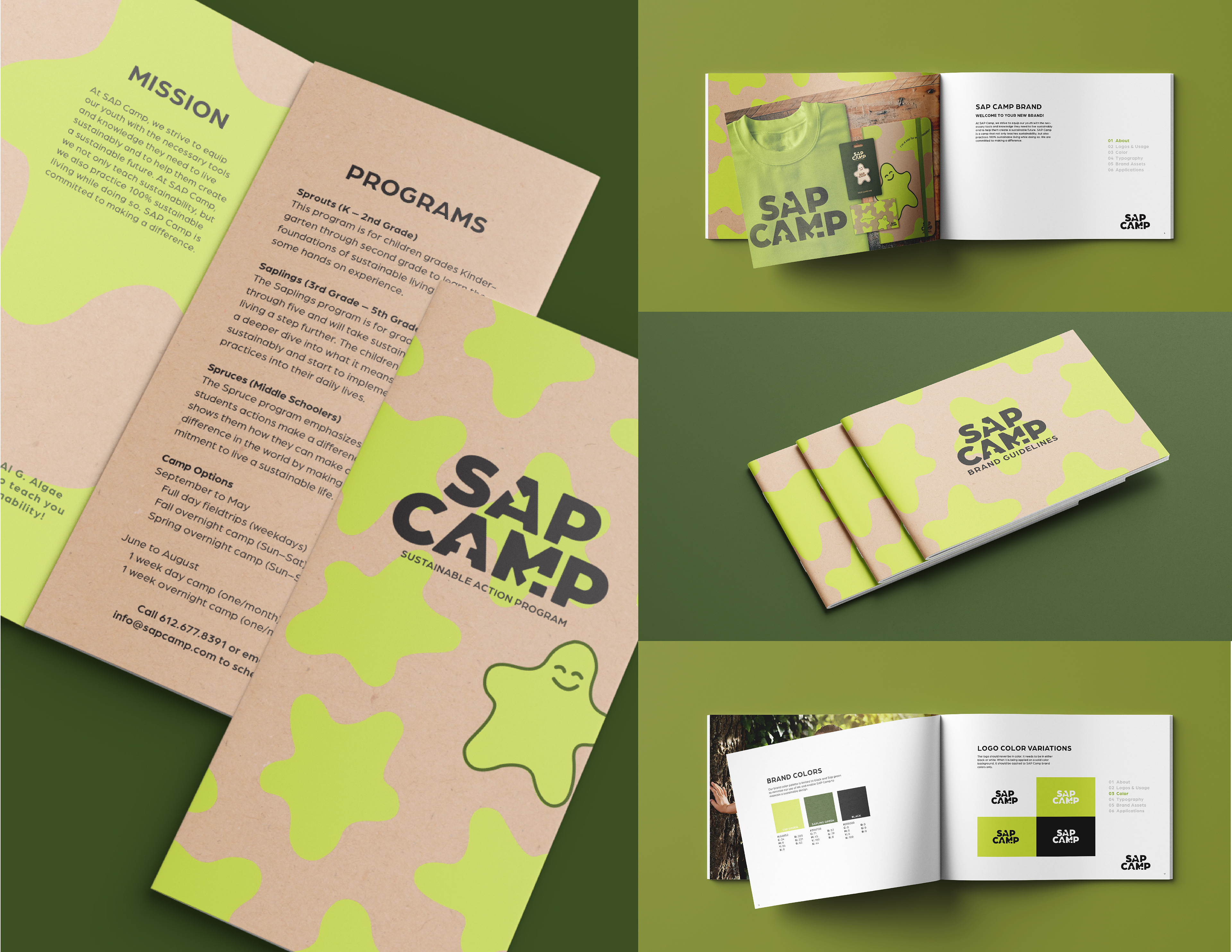
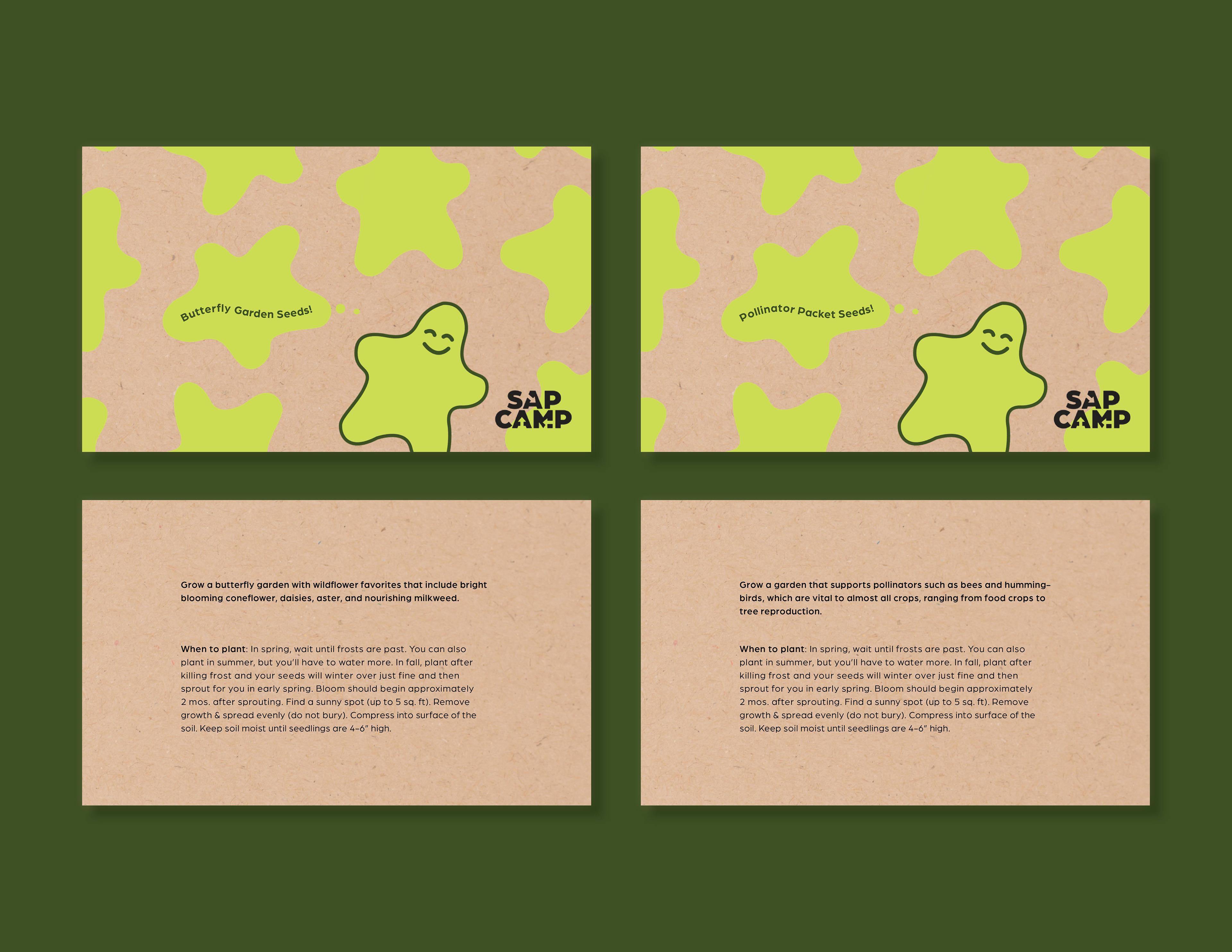
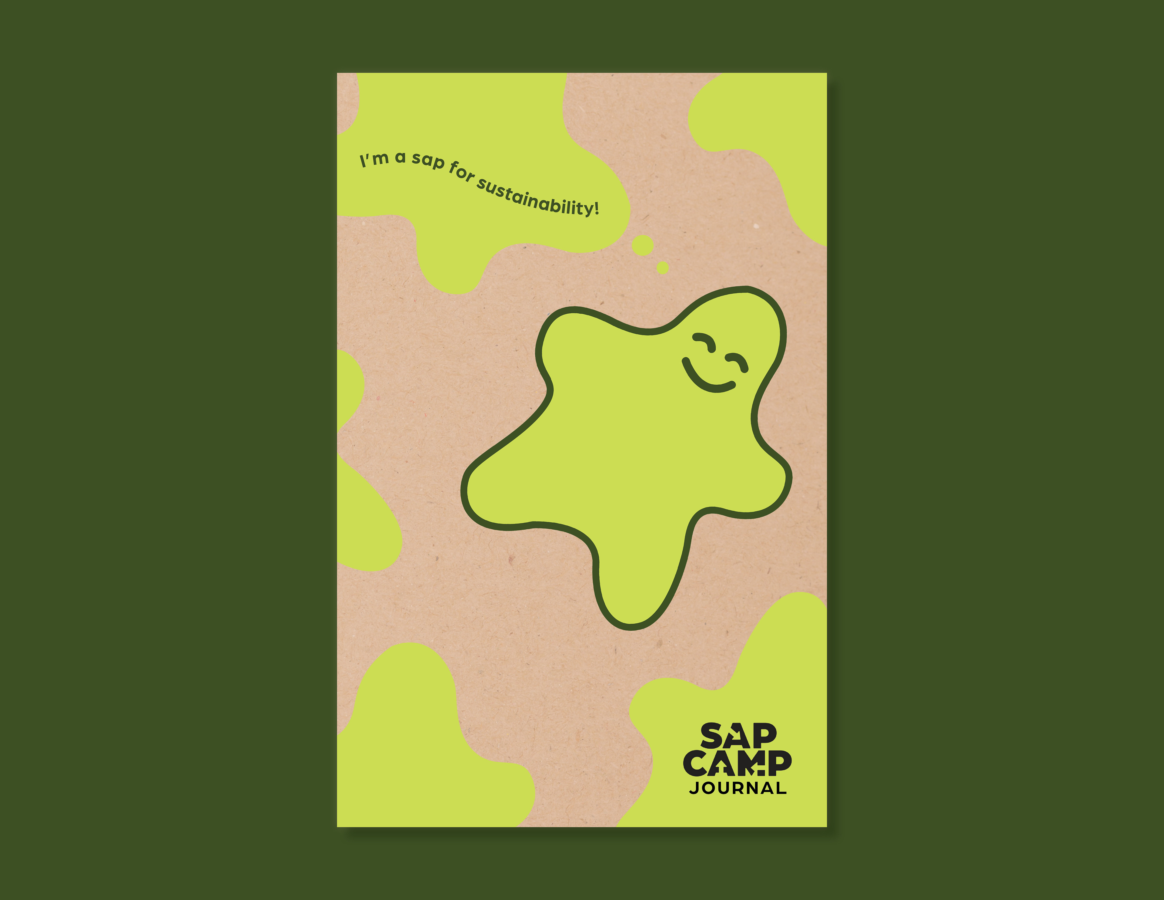
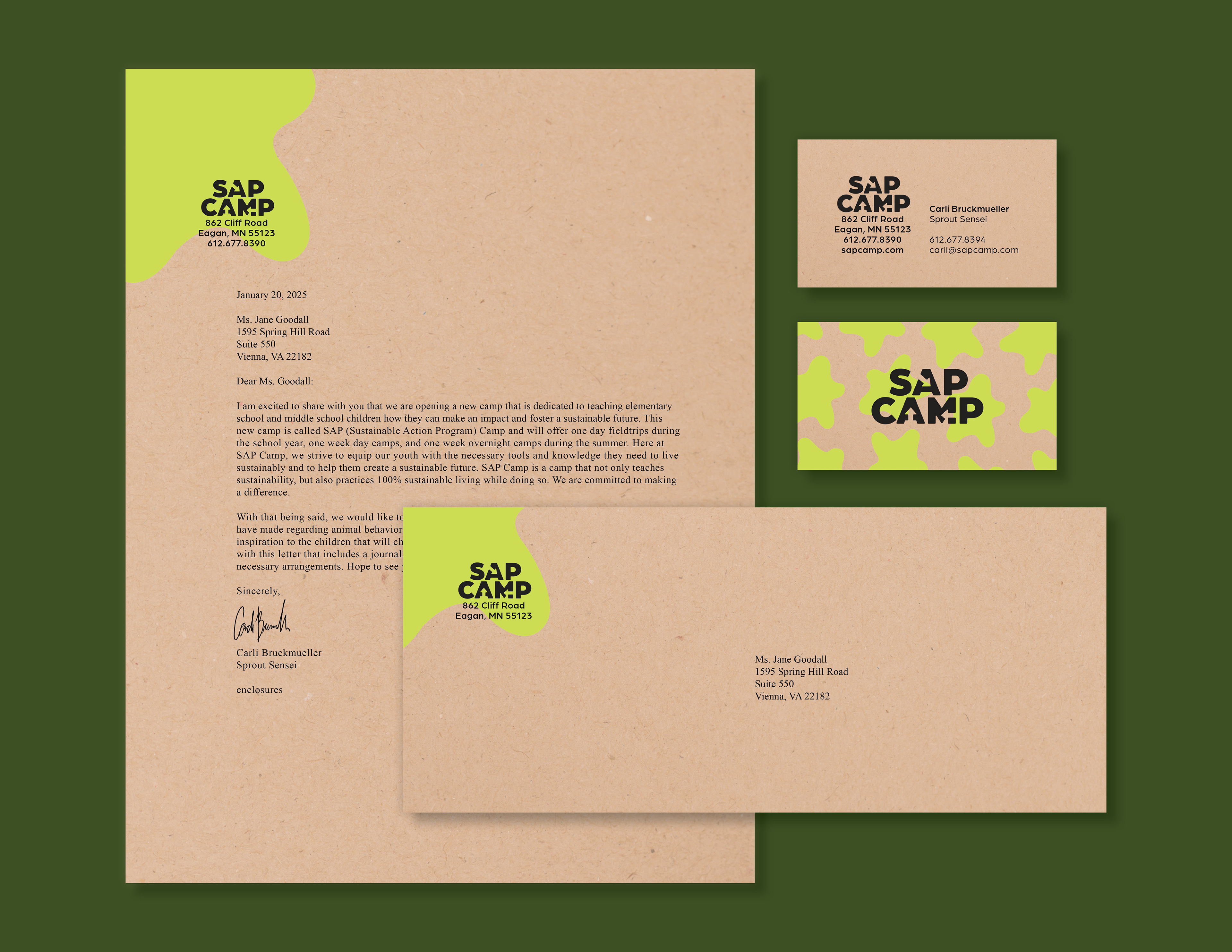
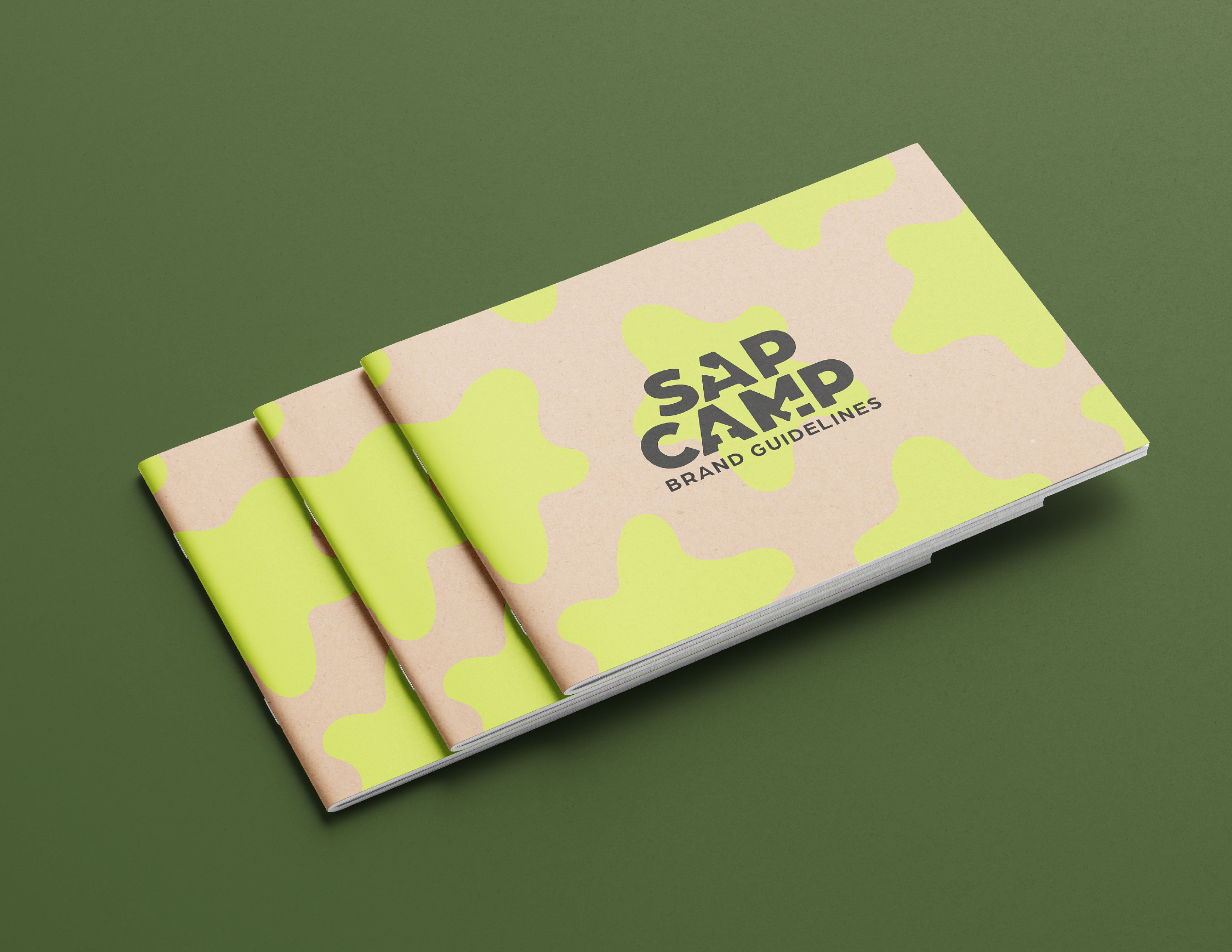
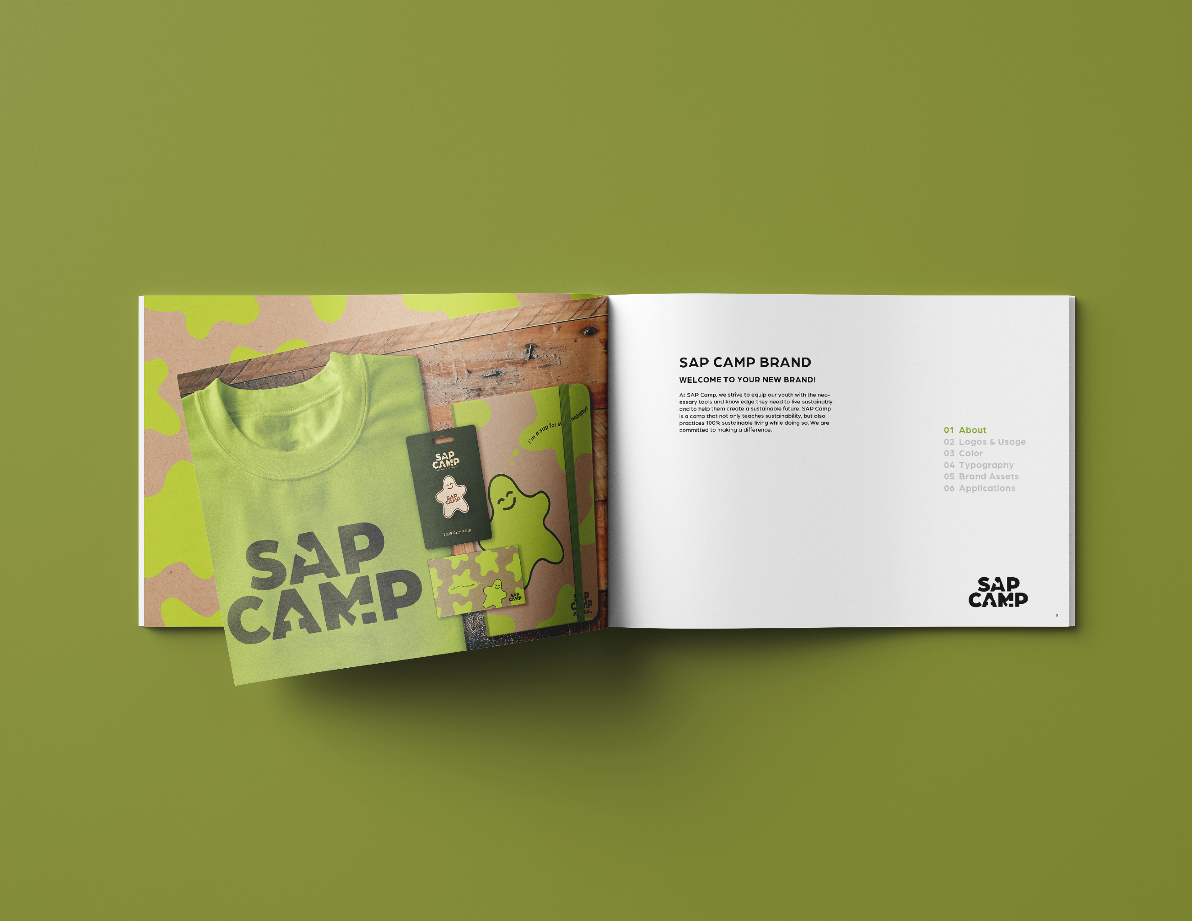
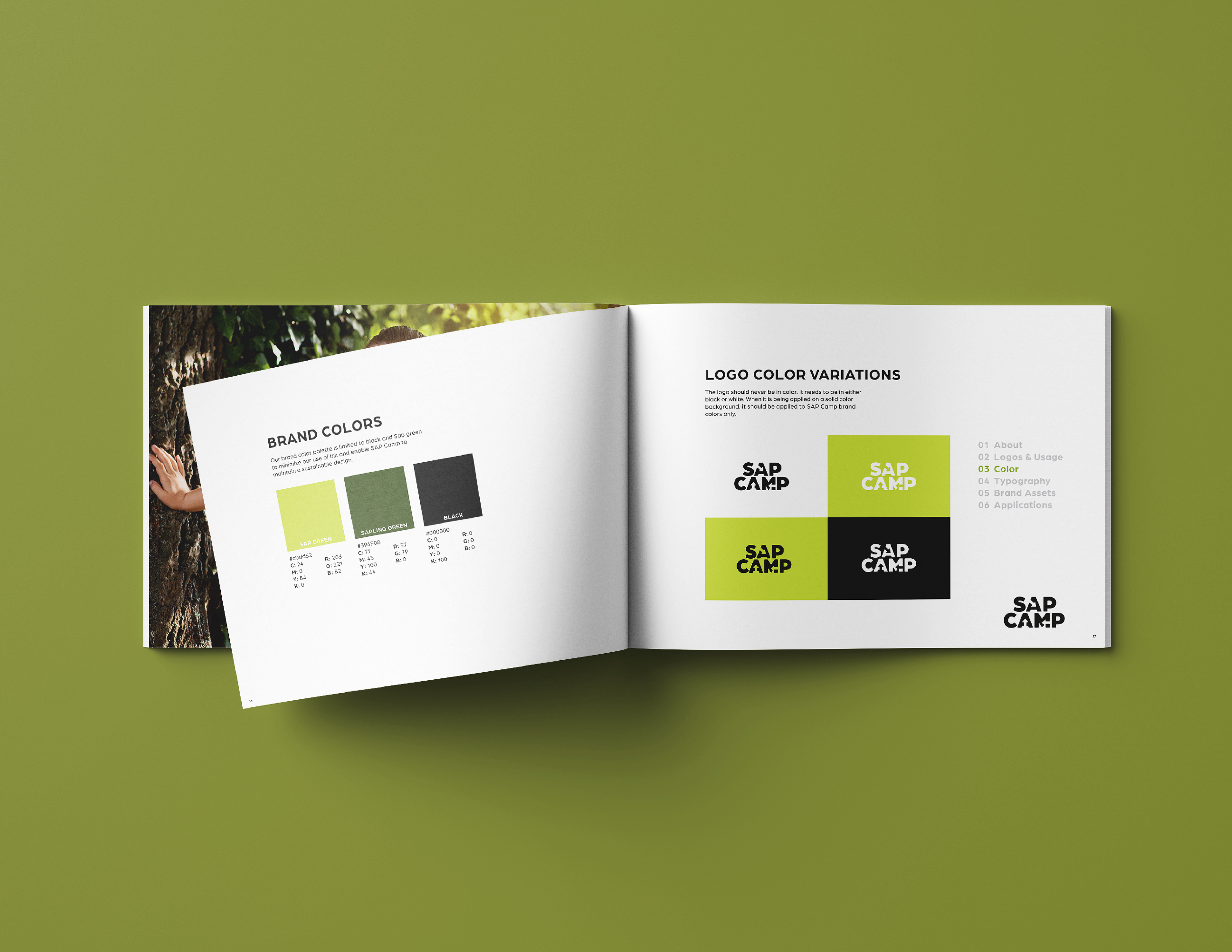
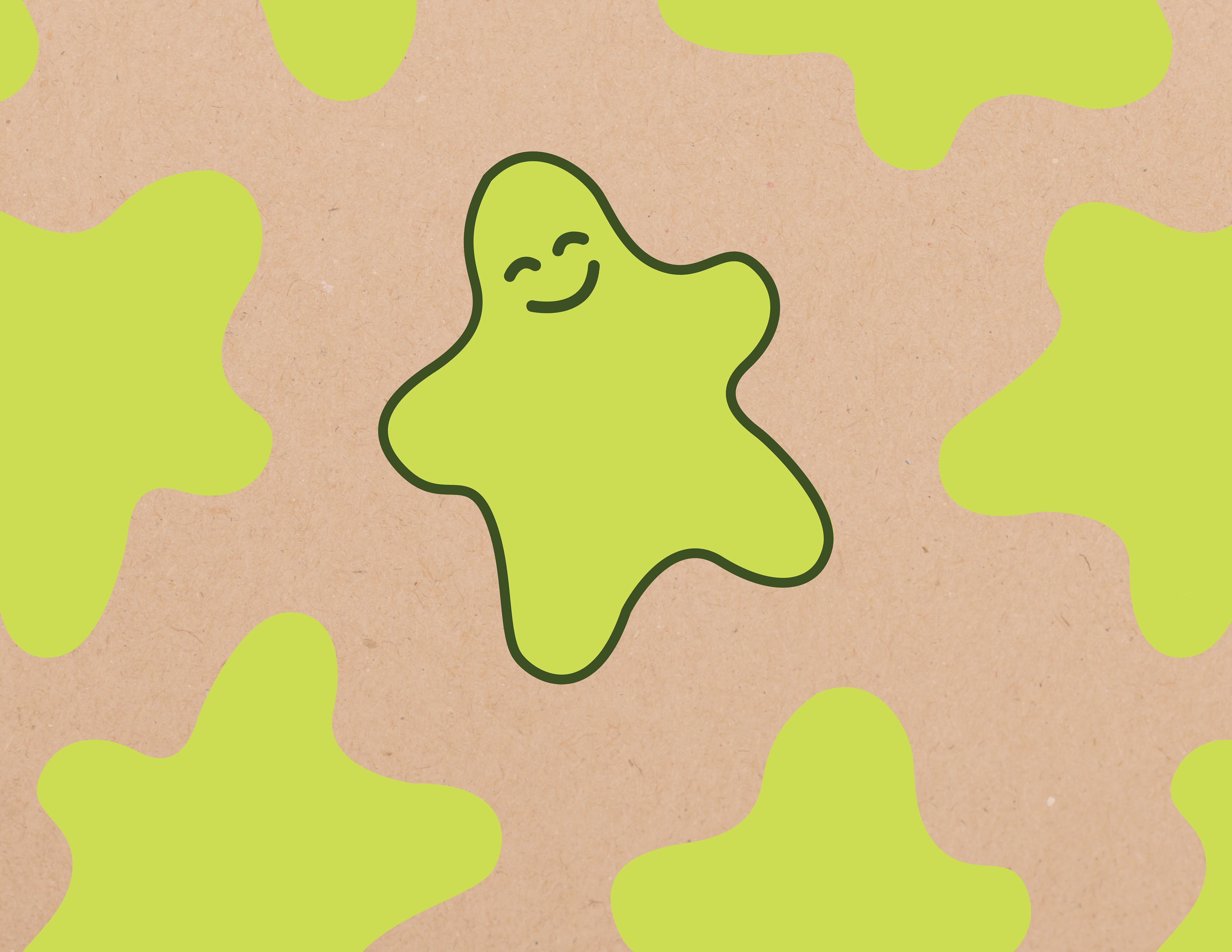
After a plethora of research and brainstorming, I landed on the idea of SAP (Sustainable Action Plan) Camp. Inspired by The Office of Ordinary Things Patagonia Boulder Guide book and their use of algae ink and sustainable design, I wanted to think about paper choices and limiting my color palette while designing a fun brand that the kids would be excited about. After tons of sketching, I developed a typographic logo and a color palette. At this point, it felt good, but not very kid-friendly. The next steps was to make it fun! This is where the idea for a camp mascot, Al G. algae was born. Al G. gave me the opportunity to include more organic shapes and color in to my design, which compliments the rounded edge typography of the logo. It also gave me the chance to create some fun brand assets to the system. I wanted to keep all collateral in mind when working out this brand instead of focusing on just the logo so at this point, I started to create my brand book and develop the system even further. This helped me to create rules for the branding and apply them systematically to other applications. Once the book was started, I started to apply the branding system I had set up to collateral and fully flesh out the SAP Camp brand.